 Botmonster Tech
Designing a Professional Home Assistant Dashboard with CSS

Professional Home Assistant
dashboards are achieved by using custom CSS Grid layouts and HACS cards like button-card to create responsive, mobile-first interfaces. Moving beyond the default grid allows you to design a “control center” that looks like a native high-end app rather than a scrolling list of toggles. This guide walks through every layer of that transformation - from understanding why the default UI falls short, to applying CSS Grid fundamentals, building a cohesive theme, structuring room-based navigation, and making everything work beautifully on the HA Companion App.
Prerequisites: You need HACS
(Home Assistant Community Store) installed, card-mod and button-card installed via HACS, and Home Assistant 2024.1 or later. All YAML examples below are copy-pasteable into the Lovelace raw YAML editor or ui-lovelace.yaml.
Why the Default Lovelace UI Falls Short
The Lovelace dashboard system that ships with Home Assistant is genuinely functional. For a first-time user, it provides a ready-made structure with entity cards, glance cards, and a sensor-friendly grid. The problem is that “functional” and “polished” are not the same thing, and power users hit the limits of the default layout surprisingly quickly.
The default Lovelace grid uses a fixed 4-column layout internally. You can adjust the number of columns in specific views, but the grid engine itself cannot be overridden without custom code. This means you cannot, for example, force a camera feed to span exactly two columns and two rows while keeping four sensor tiles adjacent to it - at least not without fighting the defaults every step of the way.
Mobile responsiveness is an afterthought in default layouts. The standard Lovelace view simply reflows cards linearly on small screens, which produces a vertically enormous scroll experience on a phone. In 2026, when the gap between HA’s default UI and commercial apps like Apple Home or Google Home has only widened, this matters more than ever. Those platforms invest heavily in polished, adaptive interfaces that HA hobbyists can now match - but only with custom CSS.
There are three main CSS injection paths in HA. card-mod is the most practical: it injects CSS directly into any card’s shadow DOM via a card_mod: key in YAML. layout-card replaces the Lovelace grid engine itself. Finally, the frontend_extra_module_url approach in configuration.yaml lets you load a custom JavaScript or CSS module globally, which is useful for theme-level overrides that do not fit the built-in theme system. For most users, card-mod combined with layout-card covers 95% of use cases.
Essential HACS Cards and Tools
A small ecosystem of HACS frontend cards forms the foundation of every serious HA dashboard project. Knowing which ones are actively maintained and which integrate cleanly with CSS saves hours of experimentation.
button-card
is the most flexible card in the HA ecosystem. It supports Jinja2 templates evaluated at render time, per-state custom CSS and icons, color transitions on entity state changes, and a rich styles: block that gives you direct access to the card’s internal CSS. If you only install one HACS card for dashboard work, make it this one.
card-mod
is the gateway to deep visual customization. It works by injecting styles into a card’s shadow DOM, the encapsulated style boundary that normally prevents external CSS from reaching inside a web component. With card-mod you can target inner elements of any standard or custom card. The card_mod: key is added directly to a card’s YAML and accepts a style: string with standard CSS.
mushroom-cards
offer Material Design 3-inspired defaults that look great immediately. Their limitation is that the CSS override points are intentionally constrained to prevent breakage, so heavy customization can feel like fighting the component. They are excellent for quick wins but less suited to fully custom layouts than button-card.

layout-card solves the grid engine problem entirely. It replaces the Lovelace grid with a configurable CSS Grid or Masonry layout, so you can define exact column templates, row heights, and named grid areas - the same tools web developers use for production interfaces.
stack-in-card
and the built-in grid-card (available natively since HA 2023.3) let you group multiple cards together visually without borders or gaps. stack-in-card removes the default background and border radius from nested cards, giving you seamless compound card layouts.
CSS Grid Fundamentals for Dashboard Design
CSS Grid is the layout primitive that makes professional HA dashboards possible. If you have never worked with it before, the concepts you actually need for dashboards fit on one page.
The most useful single line for responsive tile grids is:
display: grid;
grid-template-columns: repeat(auto-fill, minmax(200px, 1fr));
gap: 12px;
repeat(auto-fill, minmax(200px, 1fr)) tells the browser: “fill as many columns as fit, where each column is at least 200px wide but grows to share space equally.” On a wide desktop monitor you get five or six columns; on a phone held vertically you get two. This single declaration eliminates the need for explicit breakpoints in many layouts.
For more precise control - placing a camera feed across two rows while four sensor tiles sit beside it - use named grid areas:
grid-template-areas:
  "camera camera sensors-a sensors-b"
  "camera camera sensors-c sensors-d";
grid-template-columns: 1fr 1fr 1fr 1fr;
grid-template-rows: 160px 160px;
Each card is then assigned its area name via grid-area: camera; or grid-area: sensors-a;. In layout-card this maps to the layout: key in the card’s YAML. The result is pixel-precise placement that survives window resizing gracefully.
Visual polish comes from consistent application of three CSS properties: gap controls the space between grid cells (12–16px reads as “card UI” on desktop, 8px on mobile), padding inside each card defines breathing room, and border-radius creates the rounded-rectangle “card” shape that defines modern app design. Stick to one value for border radius across your entire dashboard - 12px is a widely used default that feels neither boxy nor excessively pill-shaped.
CSS Custom Properties (variables) are essential for maintaining consistency. Home Assistant already exposes 40+ variables you can reference anywhere. The most useful ones for theming:
| Variable | Default role |
|---|---|
--primary-color | Action buttons, highlights |
--card-background-color | Card fill |
--primary-text-color | Main labels |
--secondary-text-color | Subtitles, metadata |
--disabled-text-color | Off-state labels |
--ha-card-border-radius | Card corner radius |
--ha-card-box-shadow | Card elevation shadow |
By overriding these variables in your theme file, changes propagate across every card that uses them - including built-in cards - without you touching individual card configs.
Theming: Colors, Typography, and Dark Mode
Home Assistant’s built-in theme system is the cleanest place to establish a cohesive visual identity. A theme is a YAML map under frontend: in configuration.yaml that sets CSS variable values globally. Once a theme is selected via the user profile page (or automated via frontend.set_theme), its variables override the defaults across every view.
Create a theme file at config/themes/my_dark_theme.yaml and reference it in configuration.yaml:
# configuration.yaml
frontend:
  themes: !include_dir_merge_named themes/
A minimal theme file overriding the palette looks like this:
# themes/my_dark_theme.yaml
my-dark-pro:
  primary-color: "#4FC3F7"
  card-background-color: "#1E1E2E"
  primary-text-color: "#CDD6F4"
  secondary-text-color: "#A6ADC8"
  ha-card-border-radius: "12px"
  ha-card-box-shadow: "0 4px 24px rgba(0,0,0,0.4)"
  paper-card-background-color: "#1E1E2E"
For typography, you can load a custom font via @import by adding a custom_ui: entry or injecting it through frontend_extra_module_url. Google Fonts works, but for performance and privacy in a self-hosted context, a self-hosted variable font served from config/www/ is preferable:
# In your theme YAML
font-family: "'Inter Variable', system-ui, sans-serif"
Then place the font file in config/www/fonts/ and reference it in a CSS @font-face block loaded via frontend_extra_module_url.
Dark mode handling in HA can be done in two ways. The first is defining two themes and using an automation to switch between them based on sun.sun state - simple and reliable. The second, more elegant approach is using CSS’s prefers-color-scheme media query within a module loaded via frontend_extra_module_url. HA’s own dark mode toggle in user profiles also exposes a dark class on the body element that you can target in custom CSS, giving you a single theme file that adapts automatically:
/* Loaded via frontend_extra_module_url */
:root {
  --card-background-color: #F5F5F5;
  --primary-text-color: #1A1A2E;
}

:root.dark {
  --card-background-color: #1E1E2E;
  --primary-text-color: #CDD6F4;
}
Building a Room-Based Navigation Layout
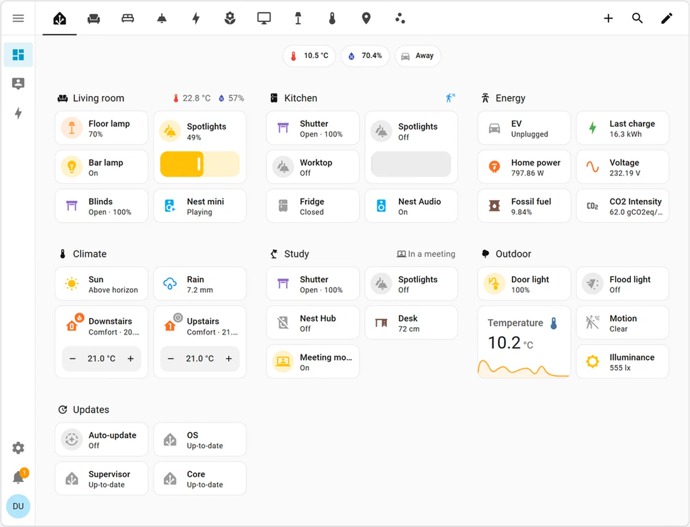
The most intuitive dashboard structure mirrors how people actually interact with their home: by room. Organizing by device type - all lights on one tab, all sensors on another - forces the user to think like a database administrator. Organizing by room (“Living Room,” “Kitchen,” “Office”) maps to how people actually move through space.
The “room card” pattern uses a single button-card to present the room name, active device count, and current temperature at a glance. Here is a complete, copy-pasteable template:
type: custom:button-card
entity: light.living_room_group
name: Living Room
show_state: false
show_icon: true
icon: mdi:sofa
tap_action:
  action: navigate
  navigation_path: /lovelace/living-room
hold_action:
  action: more-info
custom_fields:
  active_count:
    card:
      type: custom:button-card
      entity: sensor.living_room_active_devices
      show_name: false
      show_icon: false
      show_state: true
      styles:
        card:
          - background: none
          - border: none
          - padding: 0
        state:
          - font-size: 11px
          - color: var(--secondary-text-color)
  temperature:
    card:
      type: custom:button-card
      entity: sensor.living_room_temperature
      show_name: false
      show_icon: false
      show_state: true
      styles:
        card:
          - background: none
          - border: none
          - padding: 0
        state:
          - font-size: 11px
          - color: var(--secondary-text-color)
styles:
  card:
    - border-radius: 12px
    - padding: 16px
    - background: var(--card-background-color)
    - box-shadow: 0 4px 24px rgba(0,0,0,0.3)
  name:
    - font-size: 15px
    - font-weight: 600
    - color: var(--primary-text-color)
  icon:
    - width: 32px
    - color: >-
        [[[ return entity.state === 'on' ? 'var(--primary-color)' : 'var(--disabled-text-color)'; ]]]
state:
  - value: "on"
    styles:
      card:
- border-left: 3px solid var(--primary-color)The navigate: action in button-card’s tap_action is what links each room card to its dedicated Lovelace sub-view. Sub-views are defined in ui-lovelace.yaml or via the UI as additional views with their URL path set (e.g., /lovelace/living-room). This creates a clean hub-and-spoke navigation: the main view is a grid of room cards, each room opens its own detailed view.
For teams who want a more spatial approach, picture-elements card lets you use a floor plan image as the top-level navigation metaphor. Drop state-icon elements at the coordinates of each room, and navigate actions on tapping a room. The visual effect is an interactive floor plan where glowing icons indicate active devices.
For responsive stacking, layout-card in the main view is configured to show room cards in a 3-column grid on desktop and a single column on mobile:
type: custom:layout-card
layout_type: custom:grid-layout
layout:
  grid-template-columns: repeat(auto-fill, minmax(220px, 1fr))
  grid-gap: 12px
  padding: 16px
No JavaScript or media query work needed - auto-fill handles the reflow automatically.
Using card-mod to Override Shadow DOM Styles
card-mod is the tool you reach for when a card’s built-in styling properties are not enough. Here is a concrete example: overriding the header text color and removing the divider line from a standard entities card.
type: entities
title: Office Sensors
entities:
  - sensor.office_temperature
  - sensor.office_humidity
  - sensor.office_co2
card_mod:
  style: |
    ha-card {
      background: var(--card-background-color);
      border-radius: 12px;
    }
    .card-header {
      color: var(--primary-color);
      font-size: 14px;
      font-weight: 700;
      text-transform: uppercase;
      letter-spacing: 0.08em;
      padding-bottom: 0;
      border-bottom: none;
    }
    .card-content {
      padding-top: 8px;
    }
The style: | block under card_mod: is injected into the component’s shadow root, bypassing normal CSS encapsulation. The selectors target internal elements of the ha-card component. You can inspect the exact shadow DOM structure using Chrome DevTools with “Show user agent shadow DOM” enabled in the DevTools settings.
Be aware that shadow DOM structure can change between HA releases. Pin your HA version in homeassistant/configuration.yaml if you depend on deeply nested selectors, and review your card-mod styles after major HA updates.
Mobile Optimization and the HA Companion App
The Home Assistant Companion App for iOS and Android adds a layer of mobile-specific concerns that desktop-first dashboards often miss. Getting these right is the difference between a dashboard that feels like an app and one that feels like a website.
On iPhone, the home indicator bar at the bottom of the screen can overlap content on full-screen dashboards. Fix this with CSS environment variables:
ha-app-layout {
  padding-bottom: env(safe-area-inset-bottom);
}
This instructs the browser to add bottom padding equal to the safe area inset - the space the system UI requires. On iPhone 15 Pro, that is 34px. On devices without a home indicator, env(safe-area-inset-bottom) evaluates to 0, so this is safe to apply universally.
Minimum touch target size matters enormously on a dashboard that controls physical devices. Apple’s Human Interface Guidelines specify 44×44 points as the minimum tappable area. In practical terms, this means every button-card you create should have at minimum:
styles:
  card:
    - min-height: 44px
    - padding: 12px 16px
Smaller buttons lead to missed taps and, more critically, accidental activation of adjacent controls - a real problem when one button turns off lights and another arms the alarm.
HA views support a “hide header” and “hide sidebar” option in the view settings. Enabling both gives you a true full-screen experience in the Companion App: no HA header bar consuming 56px of vertical space, no sidebar on tablet. Set it per-view for room sub-views to maximize usable screen area, while keeping the main navigation view with the header visible for easy tab switching.
To test dashboard changes on mobile without leaving your desktop, use the Companion App’s built-in developer mode, or simply use Chrome DevTools’ device emulation (⌘+Shift+M on Mac). Set the device to “iPhone 15 Pro” or a Pixel 8, which gives you accurate viewport dimensions and pixel density. The HA web interface renders faithfully in emulation mode for layout testing, though touch-specific behaviors require a real device for final validation.
Performance Notes and Limits
Custom dashboards with complex button-card templates can slow rendering on older devices. Each button-card with Jinja2 template evaluation runs those templates on the frontend in JavaScript. If you have 40 room-device cards all polling state and evaluating conditional expressions, a Raspberry Pi 3 running the Companion App may stutter on initial load.
Practical mitigations:
- Use entity groups or template sensors to pre-compute values in HA’s backend (where they run efficiently in Python) rather than computing them in Jinja2 on the card. A
sensor.living_room_active_devicescomputed server-side is far cheaper than a Jinja2 expression counting active entities across a list in every card’s template. - Limit
trigger:cards - cards using thetrigger:update mechanism re-render on every specified state change. Use them selectively for cards where real-time updates matter. - Avoid deeply nested
custom_fieldswith their own sub-cards that also use Jinja2. Flatten where possible. - Test on actual target hardware. A 2024 iPad Pro renders any reasonable dashboard instantly; a 7-year-old Android phone may not. Know your device floor.
For reference, a well-optimized dashboard with 30 cards and moderate template use typically loads in under 2 seconds on mid-range hardware in 2026. The upper practical limit before noticeably impacting load time is approximately 60–80 complex button-card instances per view on the same hardware.
Pulling It Together: A Reference Architecture
The full dashboard YAML for the patterns in this post is available on GitHub for forking and adaptation. The repository structure mirrors a typical HA config setup: themes in themes/, Lovelace views split into views/, and reusable button-card templates in button-card-templates/.
For a practical starting architecture, organize your Lovelace config like this:
config/
├── ui-lovelace.yaml          # Main entry, defines views
├── themes/
│   └── my_dark_theme.yaml
├── lovelace/
│   ├── views/
│   │   ├── home.yaml         # Room grid overview
│   │   ├── living-room.yaml
│   │   ├── kitchen.yaml
│   │   └── office.yaml
│   └── templates/
│       └── room-card.yaml    # Shared button-card templates
└── www/
    └── fonts/
        └── inter-variable.woff2
Split views using !include in ui-lovelace.yaml:
# ui-lovelace.yaml
title: Home
views:
  - !include lovelace/views/home.yaml
  - !include lovelace/views/living-room.yaml
  - !include lovelace/views/kitchen.yaml
  - !include lovelace/views/office.yaml
This keeps each view file focused and independently editable, which matters when a dashboard grows to dozens of cards per room.
The combination of layout-card for the grid engine, button-card for interactive tiles, card-mod for per-card style overrides, and HA’s theme system for global variables gives you a stack that is both powerful and maintainable. Each layer has a clear responsibility, and changes at any layer propagate predictably without unexpected side effects elsewhere.
The gap between Home Assistant’s default Lovelace and what commercial smart home platforms ship has become a design choice, not a technical constraint. With the tools described here, you can close that gap - and often exceed what closed platforms allow - while keeping full local control of your home automation stack.