 Botmonster Tech
Implement Dark Mode in Vanilla CSS (Zero JavaScript)

You can implement a robust dark mode using only the prefers-color-scheme media query and CSS Custom Properties
(variables). This “CSS-first” approach delivers a completely flash-free experience for users while keeping your site’s codebase clean, lightweight, and JavaScript-independent.
Why Avoid JavaScript for Dark Mode
Most dark mode tutorials reach for JavaScript to toggle a class on <body>. It is the intuitive solution - add a button, read a preference from localStorage, apply a class - and it works well enough in demos. But in production, on real hardware, across real network conditions, this approach has critical failure modes that are worth understanding before you commit to it.
The most painful is the “Flash of Incorrect Theme” (FOIT). JavaScript executes after the browser has already parsed HTML, downloaded render-blocking resources, and performed its first paint. If a user’s OS is set to dark mode but your site defaults to light, that user sees a white screen flash before your script runs and applies the dark class. Even 50 milliseconds of incorrect theming registers as a visual glitch. Users notice. It erodes trust.
There is also a performance argument. A synchronous JavaScript dark mode requires reading from localStorage and manipulating the DOM before first paint if you want to avoid FOIT. This means either a <script> tag in <head> (which blocks the parser) or a carefully constructed inline script - both of which harm your Largest Contentful Paint (LCP)
score and complicate your Content Security Policy headers.
For static sites - and Hugo
-generated sites in particular - the argument for CSS-only is even stronger. There is no server-side session state. There is no backend to record preferences. Every page load starts fresh. The browser already knows the user’s OS-level color preference through the prefers-color-scheme media query and it knows it before a single byte of JavaScript runs. Using CSS to act on that signal is not a workaround; it is using the platform as designed.
Finally, there is a resilience argument: CSS-only dark mode works when JavaScript is disabled. This matters for privacy-conscious users running browser extensions like NoScript, for certain accessibility tools, and for web crawlers that do not execute JavaScript. A CSS-first implementation degrades gracefully to whatever theme the user’s OS reports.
CSS Custom Properties: Building a Theming Architecture
The foundation of any maintainable CSS dark mode is a well-structured set of Custom Properties (also called CSS variables). The core insight is to define semantic tokens, not raw color values. If you write color: #1a1a2e directly in a component stylesheet, switching themes means finding and replacing every hardcoded value. If you write color: var(--color-text-primary), switching themes means redefining one variable.
A useful mental model is to think of your color system in three layers:
Layer 1 - Primitive values: The raw colors your brand uses. These never appear in component stylesheets.
:root {
  --primitive-blue-500: #3b82f6;
  --primitive-gray-950: #0a0a0f;
  --primitive-gray-100: #f1f5f9;
  --primitive-white: #ffffff;
}
Layer 2 - Semantic tokens: Role-based names that describe purpose, not appearance. These are what your components reference.
:root {
  --color-background:       var(--primitive-white);
  --color-surface:          var(--primitive-gray-100);
  --color-text-primary:     var(--primitive-gray-950);
  --color-text-secondary:   #6b7280;
  --color-accent:           var(--primitive-blue-500);
  --color-border:           #e5e7eb;
}
Layer 3 - Component tokens: Optional, for complex UI elements that need their own scoped variables.
:root {
  --card-background:        var(--color-surface);
  --card-border:            var(--color-border);
  --nav-background:         var(--color-background);
}
With this structure in place, implementing dark mode requires only redefining your semantic tokens inside a prefers-color-scheme: dark media query:
@media (prefers-color-scheme: dark) {
  :root {
    --color-background:       #0d1117;
    --color-surface:          #161b22;
    --color-text-primary:     #e6edf3;
    --color-text-secondary:   #8b949e;
    --color-accent:           #58a6ff;
    --color-border:           #30363d;
  }
}
Every component that uses var(--color-background) now automatically switches between themes without a single line of component-level CSS being touched. This is the power of the token architecture: your components become theme-agnostic.
Complete Starter CSS File
Here is a production-ready starting point that you can drop directly into your project:
/* ============================================
   LAYER 1: Primitives (never used directly in components)
   ============================================ */
:root {
  --prim-white:       #ffffff;
  --prim-gray-50:     #f8fafc;
  --prim-gray-100:    #f1f5f9;
  --prim-gray-200:    #e2e8f0;
  --prim-gray-500:    #64748b;
  --prim-gray-800:    #1e293b;
  --prim-gray-900:    #0f172a;
  --prim-gray-950:    #020617;
  --prim-blue-400:    #60a5fa;
  --prim-blue-600:    #2563eb;
}

/* ============================================
   LAYER 2: Semantic Tokens - Light theme (default)
   ============================================ */
:root {
  /* Surfaces */
  --color-background:       var(--prim-white);
  --color-surface:          var(--prim-gray-50);
  --color-surface-raised:   var(--prim-gray-100);

  /* Typography */
  --color-text-primary:     var(--prim-gray-950);
  --color-text-secondary:   var(--prim-gray-500);
  --color-text-inverse:     var(--prim-white);

  /* Interactive */
  --color-accent:           var(--prim-blue-600);
  --color-accent-hover:     #1d4ed8;

  /* Borders & dividers */
  --color-border:           var(--prim-gray-200);
  --color-border-strong:    var(--prim-gray-500);

  /* Shadows (use with opacity) */
  --shadow-color:           0deg 0% 63%;
  --shadow-sm: 0.3px 0.5px 0.7px hsl(var(--shadow-color) / 0.34),
               0.4px 0.8px 1px hsl(var(--shadow-color) / 0.24);
}

/* ============================================
   LAYER 2: Semantic Tokens - Dark theme override
   ============================================ */
@media (prefers-color-scheme: dark) {
  :root {
    /* Surfaces */
    --color-background:       #0d1117;
    --color-surface:          #161b22;
    --color-surface-raised:   #21262d;

    /* Typography */
    --color-text-primary:     #e6edf3;
    --color-text-secondary:   #8b949e;
    --color-text-inverse:     #0d1117;

    /* Interactive */
    --color-accent:           var(--prim-blue-400);
    --color-accent-hover:     #93c5fd;

    /* Borders */
    --color-border:           #30363d;
    --color-border-strong:    #6e7681;

    /* Shadows (less prominent on dark) */
    --shadow-color:           215deg 30% 5%;
    --shadow-sm: 0.3px 0.5px 0.7px hsl(var(--shadow-color) / 0.6),
                 0.4px 0.8px 1px hsl(var(--shadow-color) / 0.5);
  }
}

/* ============================================
   LAYER 3: Base styles - always use tokens
   ============================================ */
body {
  background-color: var(--color-background);
  color:            var(--color-text-primary);
  font-family:      -apple-system, BlinkMacSystemFont, "Segoe UI",
                    "Helvetica Neue", Arial, sans-serif;
  line-height:      1.6;
}

a {
  color: var(--color-accent);
}

a:hover {
  color: var(--color-accent-hover);
}

hr {
  border-color: var(--color-border);
}
Notice that the body font-family uses the system font stack
. System fonts - -apple-system on macOS/iOS, Segoe UI on Windows, Roboto on Android via the generic sans-serif fallback - are designed by the same teams that designed the OS dark mode UI. They have excellent legibility at all weights on both light and dark backgrounds, and they load at zero cost since no web font request is made.
CSS Color Level 5: Generating Palettes Mathematically
CSS Color Level 5
introduces powerful new functions that let you derive your entire dark theme from a single brand color mathematically, eliminating the need to manually choose and maintain two separate palettes. In 2026, color-mix() has broad support across all modern browsers, and relative color syntax is available in Safari 17.4+, Chrome 119+, and Firefox 128+.
color-mix()
The color-mix() function blends two colors in a specified color space. The OKLCH color space
is the recommended choice for UI theming because it is perceptually uniform - equal numerical steps produce equal perceived changes in lightness. Other color spaces like sRGB produce visible skewing when mixing.
@media (prefers-color-scheme: dark) {
  :root {
    /* Generate a dark background from your brand blue */
    --color-background: color-mix(in oklch, var(--prim-blue-600) 8%, #000000);

    /* Generate a subtle surface tint */
    --color-surface: color-mix(in oklch, var(--prim-blue-600) 12%, #0a0a0f);
  }
}
Relative Color Syntax
Relative color syntax is even more expressive. It lets you take any existing color and mathematically transform its lightness (l), chroma (c), and hue (h) components:
:root {
  --brand: oklch(55% 0.22 265);

  /* Generate a complete 5-shade scale from one value */
  --brand-100: oklch(from var(--brand) 95% calc(c * 0.15) h);
  --brand-300: oklch(from var(--brand) 75% calc(c * 0.6) h);
  --brand-500: var(--brand);
  --brand-700: oklch(from var(--brand) 38% calc(c * 0.9) h);
  --brand-900: oklch(from var(--brand) 18% calc(c * 0.5) h);
}
With this technique, changing --brand automatically regenerates the entire palette. Your light theme uses --brand-500 and --brand-700 for text and interactive elements; your dark theme uses --brand-300 and --brand-100 for better contrast on dark backgrounds.
For projects that need to support older browsers, provide a static fallback value before the color-mix() call. Browsers that do not understand the function will silently use the fallback:
:root {
  --color-surface: #161b22; /* fallback */
  --color-surface: color-mix(in oklch, var(--brand) 12%, #0a0a0f);
}
Container Queries for Scoped Theming
The prefers-color-scheme media query operates at the page level - it tells you what the user’s OS prefers, not what a specific component’s context requires. Modern designs sometimes need finer-grained control: a dark sidebar containing a card that should appear slightly lighter, a dark promotional banner embedded in a light-themed page, or a widget that always renders in a specific theme regardless of the user’s OS setting.
CSS Container Queries
, specifically the @container style() variant, enable this pattern. Style queries let a child element inspect a custom property on its container and respond accordingly:
/* Mark the sidebar as a theming container */
.sidebar {
  container-name: sidebar;
  container-type: inline-size;
  --theme: dark;
  background-color: #0d1117;
}

/* Any card inside the sidebar adapts */
@container sidebar style(--theme: dark) {
  .card {
    --card-background: #161b22;
    --card-text:       #e6edf3;
    --card-border:     #30363d;
  }
}
This creates a two-tier theming system: the OS-level prefers-color-scheme sets the global default, while individual containers can override that for their children. Components remain unaware of their context - they always reference var(--card-background) - and the container system handles the rest.
Style queries have good browser support in 2026 (Chrome 111+, Safari 17.2+, Firefox 129+), but a graceful degradation strategy is still worthwhile for edge cases. The fallback is simply the uncontained default: if a browser does not support style queries, the component renders using the global theme tokens, which is a perfectly acceptable baseline.
Providing a Manual Toggle Without JavaScript
The prefers-color-scheme approach is automatic and respects the user’s OS setting, but some users want to override their OS preference specifically for your site. Implementing this without JavaScript requires a CSS technique built around the hidden checkbox pattern.
The mechanism works like this: an <input type="checkbox"> element is placed at the top of your HTML and visually hidden. A <label> element styled as your toggle button is associated with it via the for attribute. When the user clicks the label, the checkbox toggles its :checked state, which CSS can then react to using the :has() pseudo-class:
<input type="checkbox" id="theme-toggle" class="visually-hidden" />
<label for="theme-toggle" class="theme-switcher" aria-label="Toggle dark mode">
  <span class="theme-switcher__icon">◑</span>
</label>.visually-hidden {
position: absolute;
width: 1px;
height: 1px;
overflow: hidden;
clip: rect(0, 0, 0, 0);
white-space: nowrap;
}
/* Default: respect OS preference */
@media (prefers-color-scheme: dark) {
:root {
--color-background: #0d1117;
--color-text-primary: #e6edf3;
/* ... all dark tokens ... */
}
}
/* Manual override: user clicked the toggle to switch TO dark */
html:has(#theme-toggle:checked) {
--color-background: #0d1117;
--color-text-primary: #e6edf3;
/* ... all dark tokens ... */
}
/* Manual override: user on dark OS who clicked toggle to switch TO light */
@media (prefers-color-scheme: dark) {
html:has(#theme-toggle:checked) {
--color-background: #ffffff;
--color-text-primary: #020617;
/* ... all light tokens ... */
}
}The :has() pseudo-class - now supported in all major browsers
as of 2024 - makes this pattern clean and readable. The html:has(#theme-toggle:checked) selector scopes the theme change from the root element downward, affecting every component on the page.
The important trade-off to be honest about: This CSS-only toggle does not persist across page loads. When a user navigates to a new page or refreshes, the checkbox resets to unchecked and the OS preference is used again. For many sites - especially blogs and content sites where users are reading rather than configuring - this is perfectly acceptable behavior. The primary theme is already correct (it matches the OS), and the override is a momentary preference.
If persistence is a hard requirement for your use case, that is the genuine justification for adding a small piece of JavaScript: read localStorage on page load, apply the override class before first paint, and write to localStorage on toggle. But for the majority of static sites, the CSS-only approach covers the real-world need without the FOIT risk.
Theming SVGs and Third-Party Embeds
CSS Custom Properties have excellent reach across your own HTML and CSS, but there are two areas where dark mode requires explicit attention.
Inline vs. External SVGs
SVG
icons and illustrations embedded directly in your HTML - either written as <svg> elements in markup or injected at build time - respond fully to CSS Custom Properties. You can use fill: var(--color-accent) and the SVG element will update along with your theme:
/* Works perfectly for inline SVGs */
.icon {
  fill: var(--color-text-primary);
}
Externally linked SVGs - referenced via <img src="icon.svg"> or CSS background-image: url('icon.svg') - live in their own isolated rendering context. They cannot see your page’s CSS Custom Properties. For these, you have two strategies:
Convert to inline: Embed the SVG source directly in your HTML at build time. Hugo makes this straightforward with its
resources.Getandtransform.Unmarshalpipeline functions, which let you read an SVG file and output its source inline in a template.Use CSS
filterfor simple tinting: For monochrome icons that just need to be light on dark backgrounds, CSSfiltercan approximate a color shift without touching the SVG source:
@media (prefers-color-scheme: dark) {
  img.icon {
    filter: invert(1) hue-rotate(180deg);
  }
}
This is a blunt instrument and produces artifacts on complex, colorful SVGs. Use it only for simple monochrome marks where the exact output color is not critical.
Third-Party Embeds
YouTube iframes, CodePen embeds, Twitter/X widgets, and similar third-party content exist in their own iframe context and respond only to their own internal theming options - not to your CSS variables. Your options are limited:
- YouTube: Append
?color=whiteto your embed URL for a slightly lighter chrome, but full dark mode is not available via URL parameters. - CodePen: Use the
?theme-id=darkURL parameter to request the dark editor theme for embedded pens. - Wrapper styling: Apply a dark surface
background-colorand roundedborder-radiusto the container<div>around the embed. This at least reduces the contrast between your dark page and the embed’s light chrome. - Accept the limitation: For content-first sites, a slightly mismatched embed is a minor UX issue that does not warrant the complexity of a JavaScript-mediated solution. Acknowledge it in your design system as a known third-party exception.
Testing and Validating Your Dark Mode
A dark mode implementation is only as good as its verification across every component, viewport, and browser. A systematic testing process prevents the common failure modes: insufficient contrast on secondary text, images with hardcoded white backgrounds that glow on dark themes, and hover/focus states that become invisible.
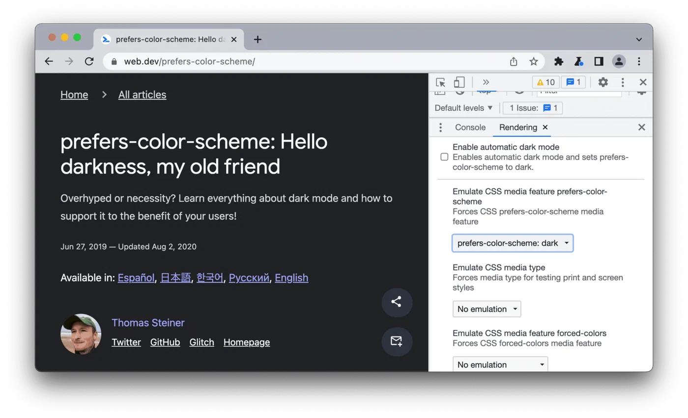
Browser DevTools Simulation
Chrome and Edge DevTools have a “Rendering” panel (accessible via the three-dot menu > More Tools > Rendering) with a “Emulate CSS media feature prefers-color-scheme” dropdown. Setting it to dark immediately applies your dark theme without changing your OS setting. This is the fastest feedback loop during development.
Firefox DevTools has an equivalent toggle in the Inspector toolbar - a small sun/moon icon next to the responsive design mode button.
Safari on macOS lets you toggle dark mode quickly via System Settings > Appearance, which is fast enough for spot-checking during development.
Contrast Ratio Checking
The most common dark mode failure is insufficient contrast on secondary text. Many developers choose a mid-gray like #6b7280 for secondary text in light mode (where it achieves around 4.6:1 against white, passing WCAG AA) and then either forget to change it in dark mode or choose a value that fails against a dark background.
Run a Lighthouse accessibility audit while emulating dark mode in DevTools. Lighthouse will flag any text that fails the 4.5:1 ratio required for normal text (WCAG AA) or 3:1 for large text. Pay particular attention to:
- Placeholder text in form inputs
- Disabled button states
- Helper text beneath form fields
- Figure captions rendered as visible text
Cross-Browser Verification for CSS Color Level 5
If you are using color-mix() or relative color syntax, verify these across browsers. The compatibility matrix in 2026:
| Feature | Chrome | Firefox | Safari |
|---|---|---|---|
color-mix() | 119+ | 128+ | 17.4+ |
| Relative color syntax | 119+ | 128+ | 17.4+ |
| Style container queries | 111+ | 129+ | 17.2+ |
:has() | 105+ | 121+ | 15.4+ |
Chrome’s inspector shows the computed contrast ratio when you hover over a color swatch in the Styles panel - use this to spot-check text colors across your component library in both themes.
Zero-JavaScript and Zero-CSS Baseline
Test your site with CSS entirely disabled (Firefox’s View > Page Style > No Style menu option, or a browser extension). The raw HTML should be legible - proper heading hierarchy, visible paragraph text, functional links. This verifies your semantic HTML foundation, which underpins all CSS theming.
Then test with only JavaScript disabled (via DevTools > Settings > Preferences > Debugger > Disable JavaScript). Your dark mode should remain fully functional since it requires no JavaScript at all. If something breaks, you have accidentally introduced a JS dependency somewhere.
Pulling It Together
The CSS-first dark mode stack described here is not a single technique - it is an architecture. CSS Custom Properties give you the token system. The prefers-color-scheme media query gives you automatic OS-level switching. CSS Color Level 5 functions let you generate coherent palettes mathematically from a single brand color. Container style queries let you scope themes to individual components. The :has() checkbox pattern gives you a persistence-free manual toggle for users who want to override their OS setting.
Each layer is independently useful. You can adopt the token architecture without color-mix(). You can skip container queries if your layout does not need them. You can omit the manual toggle entirely if auto-switching on OS preference is sufficient for your audience.
What you get in return for this investment is a dark mode that loads correctly on the very first paint for every user on every device, without a single line of JavaScript, without a localStorage read, and without a blocking script tag in your <head>. For static sites built with Hugo or any other generator, that is the right foundation to build on.