 Botmonster Tech
Implement Dark Mode in Vanilla CSS (Zero JavaScript)

You can build a solid dark mode using only the prefers-color-scheme media query and CSS Custom Properties
(variables). This CSS-first approach gives users a flash-free theme switch. It also keeps your site’s code clean, light, and free of JavaScript.
Why Avoid JavaScript for Dark Mode
Most dark mode tutorials reach for JavaScript to toggle a class on <body>. It feels like the obvious fix. You add a button, read a preference from localStorage, and apply a class. It works well enough in demos. But in production, on real hardware and real networks, this approach breaks in ways worth knowing about before you commit to it.
The worst one is the Flash of Incorrect Theme (FOIT). JavaScript runs only after the browser has parsed HTML, fetched render-blocking files, and done its first paint. Say a user’s OS is set to dark mode but your site defaults to light. That user sees a white flash before your script runs and applies the dark class. Even 50 milliseconds of the wrong theme reads as a glitch. Users notice it. It chips away at trust.
There is a speed cost too. To avoid FOIT, a JavaScript dark mode has to read localStorage and change the DOM before first paint. That forces one of two things: a <script> tag in <head> that blocks the parser, or a hand-built inline script. Both hurt your Largest Contentful Paint (LCP)
score and make your Content Security Policy headers harder to write.
For static sites, and Hugo
-generated sites in particular, the case for CSS-only is even stronger. There is no server-side session state. There is no backend to store preferences. Every page load starts fresh. The browser already knows the user’s OS-level color choice through the prefers-color-scheme media query. It knows it before a single byte of JavaScript runs. Using CSS to act on that signal is not a hack. It is using the platform as designed.
There is one more point: a CSS-only dark mode still works when JavaScript is off. That helps privacy-minded users running extensions like NoScript. It helps some accessibility tools. It helps web crawlers that do not run JavaScript. A CSS-first build falls back cleanly to whatever theme the user’s OS reports.
CSS Custom Properties: Building a Theming Architecture
A clean CSS dark mode rests on a well-built set of Custom Properties (also called CSS variables). The key idea is to define semantic tokens, not raw color values. Write color: #1a1a2e straight into a component stylesheet, and switching themes means finding and replacing every hardcoded value. Write color: var(--color-text-primary) instead, and switching themes means redefining one variable.
A handy way to picture your color system is in three layers:
Layer 1 - Primitive values: The raw colors your brand uses. These never show up in component stylesheets.
:root {
  --primitive-blue-500: #3b82f6;
  --primitive-gray-950: #0a0a0f;
  --primitive-gray-100: #f1f5f9;
  --primitive-white: #ffffff;
}
Layer 2 - Semantic tokens: Role-based names that say what a color is for, not how it looks. These are what your components point to.
:root {
  --color-background:       var(--primitive-white);
  --color-surface:          var(--primitive-gray-100);
  --color-text-primary:     var(--primitive-gray-950);
  --color-text-secondary:   #6b7280;
  --color-accent:           var(--primitive-blue-500);
  --color-border:           #e5e7eb;
}
Layer 3 - Component tokens: Optional, for complex UI elements that need their own scoped variables.
:root {
  --card-background:        var(--color-surface);
  --card-border:            var(--color-border);
  --nav-background:         var(--color-background);
}
With this structure in place, dark mode just means redefining your semantic tokens inside a prefers-color-scheme: dark media query:
@media (prefers-color-scheme: dark) {
  :root {
    --color-background:       #0d1117;
    --color-surface:          #161b22;
    --color-text-primary:     #e6edf3;
    --color-text-secondary:   #8b949e;
    --color-accent:           #58a6ff;
    --color-border:           #30363d;
  }
}
Every component that uses var(--color-background) now switches themes on its own. You touch no component-level CSS at all. That is the strength of the token model: your components become theme-agnostic.
Complete Starter CSS File
Here is a ready-to-ship starting point you can drop straight into your project:
/* ============================================
   LAYER 1: Primitives (never used directly in components)
   ============================================ */
:root {
  --prim-white:       #ffffff;
  --prim-gray-50:     #f8fafc;
  --prim-gray-100:    #f1f5f9;
  --prim-gray-200:    #e2e8f0;
  --prim-gray-500:    #64748b;
  --prim-gray-800:    #1e293b;
  --prim-gray-900:    #0f172a;
  --prim-gray-950:    #020617;
  --prim-blue-400:    #60a5fa;
  --prim-blue-600:    #2563eb;
}

/* ============================================
   LAYER 2: Semantic Tokens - Light theme (default)
   ============================================ */
:root {
  /* Surfaces */
  --color-background:       var(--prim-white);
  --color-surface:          var(--prim-gray-50);
  --color-surface-raised:   var(--prim-gray-100);

  /* Typography */
  --color-text-primary:     var(--prim-gray-950);
  --color-text-secondary:   var(--prim-gray-500);
  --color-text-inverse:     var(--prim-white);

  /* Interactive */
  --color-accent:           var(--prim-blue-600);
  --color-accent-hover:     #1d4ed8;

  /* Borders & dividers */
  --color-border:           var(--prim-gray-200);
  --color-border-strong:    var(--prim-gray-500);

  /* Shadows (use with opacity) */
  --shadow-color:           0deg 0% 63%;
  --shadow-sm: 0.3px 0.5px 0.7px hsl(var(--shadow-color) / 0.34),
               0.4px 0.8px 1px hsl(var(--shadow-color) / 0.24);
}

/* ============================================
   LAYER 2: Semantic Tokens - Dark theme override
   ============================================ */
@media (prefers-color-scheme: dark) {
  :root {
    /* Surfaces */
    --color-background:       #0d1117;
    --color-surface:          #161b22;
    --color-surface-raised:   #21262d;

    /* Typography */
    --color-text-primary:     #e6edf3;
    --color-text-secondary:   #8b949e;
    --color-text-inverse:     #0d1117;

    /* Interactive */
    --color-accent:           var(--prim-blue-400);
    --color-accent-hover:     #93c5fd;

    /* Borders */
    --color-border:           #30363d;
    --color-border-strong:    #6e7681;

    /* Shadows (less prominent on dark) */
    --shadow-color:           215deg 30% 5%;
    --shadow-sm: 0.3px 0.5px 0.7px hsl(var(--shadow-color) / 0.6),
                 0.4px 0.8px 1px hsl(var(--shadow-color) / 0.5);
  }
}

/* ============================================
   LAYER 3: Base styles - always use tokens
   ============================================ */
body {
  background-color: var(--color-background);
  color:            var(--color-text-primary);
  font-family:      -apple-system, BlinkMacSystemFont, "Segoe UI",
                    "Helvetica Neue", Arial, sans-serif;
  line-height:      1.6;
}

a {
  color: var(--color-accent);
}

a:hover {
  color: var(--color-accent-hover);
}

hr {
  border-color: var(--color-border);
}
Notice that the body font-family uses the system font stack
. System fonts come from the same teams that built the OS dark mode UI: -apple-system on macOS and iOS, Segoe UI on Windows, Roboto on Android through the generic sans-serif fallback. They read well at every weight on both light and dark backgrounds. They also load at zero cost, since no web font request is made.
CSS Color Level 5: Generating Palettes Mathematically
CSS Color Level 5
adds new functions that let you derive your whole dark theme from one brand color with math. You no longer pick and maintain two separate palettes by hand. In 2026, color-mix() works across all modern browsers. Relative color syntax is live in Safari 17.4+, Chrome 119+, and Firefox 128+.
color-mix()
The color-mix() function blends two colors in a color space you name. For UI theming, the OKLCH color space
is the best pick because it is perceptually uniform. Equal number steps produce equal perceived shifts in lightness. Other color spaces like sRGB skew in visible ways when you mix.
@media (prefers-color-scheme: dark) {
  :root {
    /* Generate a dark background from your brand blue */
    --color-background: color-mix(in oklch, var(--prim-blue-600) 8%, #000000);

    /* Generate a subtle surface tint */
    --color-surface: color-mix(in oklch, var(--prim-blue-600) 12%, #0a0a0f);
  }
}
Relative Color Syntax
Relative color syntax goes even further. It lets you take any color you have and reshape its lightness (l), chroma (c), and hue (h) with math:
:root {
  --brand: oklch(55% 0.22 265);

  /* Generate a complete 5-shade scale from one value */
  --brand-100: oklch(from var(--brand) 95% calc(c * 0.15) h);
  --brand-300: oklch(from var(--brand) 75% calc(c * 0.6) h);
  --brand-500: var(--brand);
  --brand-700: oklch(from var(--brand) 38% calc(c * 0.9) h);
  --brand-900: oklch(from var(--brand) 18% calc(c * 0.5) h);
}
With this trick, changing --brand rebuilds the whole palette on its own. Your light theme uses --brand-500 and --brand-700 for text and clickable elements. Your dark theme uses --brand-300 and --brand-100 for better contrast on dark backgrounds.
If your project must support older browsers, set a static fallback value before the color-mix() call. Browsers that do not know the function quietly use the fallback:
:root {
  --color-surface: #161b22; /* fallback */
  --color-surface: color-mix(in oklch, var(--brand) 12%, #0a0a0f);
}
Container Queries for Scoped Theming
The prefers-color-scheme media query works at the page level. It tells you what the user’s OS prefers, not what a single component needs. Modern designs sometimes want finer control. Think of a dark sidebar holding a card that should look a bit lighter, a dark banner sitting inside a light page, or a widget that always renders in one theme no matter the OS setting.
CSS Container Queries
, and the @container style() variant in particular, make this pattern work. Style queries let a child element read a custom property on its container and react to it:
/* Mark the sidebar as a theming container */
.sidebar {
  container-name: sidebar;
  container-type: inline-size;
  --theme: dark;
  background-color: #0d1117;
}

/* Any card inside the sidebar adapts */
@container sidebar style(--theme: dark) {
  .card {
    --card-background: #161b22;
    --card-text:       #e6edf3;
    --card-border:     #30363d;
  }
}
This builds a two-tier theming system. The OS-level prefers-color-scheme sets the global default. Single containers can then override that for their children. Components stay blind to their context. They always reference var(--card-background), and the container system handles the rest.
Style queries have solid browser support in 2026 (Chrome 111+, Safari 17.2+, Firefox 129+). Even so, a fallback plan still pays off for edge cases. The fallback is just the uncontained default. If a browser does not support style queries, the component renders with the global theme tokens. That is a fine baseline.
Providing a Manual Toggle Without JavaScript
The prefers-color-scheme approach is automatic and respects the user’s OS setting. Still, some users want to override their OS choice just for your site. You can do this without JavaScript using a CSS trick built on the hidden checkbox pattern.
Here is how it works. You place an <input type="checkbox"> at the top of your HTML and hide it visually. A <label> styled as your toggle button links to it through the for attribute. When the user clicks the label, the checkbox flips its :checked state. CSS can then react to that state with the :has() pseudo-class:
<input type="checkbox" id="theme-toggle" class="visually-hidden" />
<label for="theme-toggle" class="theme-switcher" aria-label="Toggle dark mode">
  <span class="theme-switcher__icon">◑</span>
</label>.visually-hidden {
position: absolute;
width: 1px;
height: 1px;
overflow: hidden;
clip: rect(0, 0, 0, 0);
white-space: nowrap;
}
/* Default: respect OS preference */
@media (prefers-color-scheme: dark) {
:root {
--color-background: #0d1117;
--color-text-primary: #e6edf3;
/* ... all dark tokens ... */
}
}
/* Manual override: user clicked the toggle to switch TO dark */
html:has(#theme-toggle:checked) {
--color-background: #0d1117;
--color-text-primary: #e6edf3;
/* ... all dark tokens ... */
}
/* Manual override: user on dark OS who clicked toggle to switch TO light */
@media (prefers-color-scheme: dark) {
html:has(#theme-toggle:checked) {
--color-background: #ffffff;
--color-text-primary: #020617;
/* ... all light tokens ... */
}
}The :has() pseudo-class, supported in all major browsers
since 2024, keeps this pattern clean and easy to read. The html:has(#theme-toggle:checked) selector scopes the theme change from the root element down. It reaches every component on the page.
One trade-off to be honest about: This CSS-only toggle does not persist across page loads. When a user opens a new page or refreshes, the checkbox resets to unchecked and the OS choice takes over again. For many sites, this is fine. Blogs and content sites mostly serve readers, not people tuning settings. The main theme is already right, since it matches the OS, and the override is a short-lived preference.
If persistence is a hard requirement for you, that is the real reason to add a small piece of JavaScript. Read localStorage on page load, apply the override class before first paint, and write to localStorage on toggle. But for most static sites, the CSS-only approach covers the real need without the FOIT risk.
Theming SVGs and Third-Party Embeds
CSS Custom Properties reach far across your own HTML and CSS. But two areas still need direct attention for dark mode.
Inline vs. External SVGs
SVG
icons and art embedded straight into your HTML respond fully to CSS Custom Properties. This holds whether you write <svg> elements in markup or inject them at build time. Use fill: var(--color-accent) and the SVG updates along with your theme:
/* Works perfectly for inline SVGs */
.icon {
  fill: var(--color-text-primary);
}
Externally linked SVGs are different. When you reference one through <img src="icon.svg"> or CSS background-image: url('icon.svg'), it lives in its own isolated rendering context. It cannot see your page’s CSS Custom Properties. For these, you have two options:
Convert to inline: Embed the SVG source straight into your HTML at build time. Hugo makes this easy with its
resources.Getandtransform.Unmarshalpipeline functions. They let you read an SVG file and output its source inline in a template. Hugo’s resource processing functions handle this and a lot more at build time. If your logo or icons only exist as PNGs, turn each bitmap into SVG source first. That gives you vector markup that can pick upcurrentColorand theme along with the rest of your tokens.Use CSS
filterfor simple tinting: For monochrome icons that just need to be light on dark backgrounds, CSSfiltercan approximate a color shift without touching the SVG source:
@media (prefers-color-scheme: dark) {
  img.icon {
    filter: invert(1) hue-rotate(180deg);
  }
}
This is a blunt tool. It produces artifacts on complex, colorful SVGs. Use it only for simple monochrome marks where the exact output color is not critical.
Third-Party Embeds
YouTube iframes, CodePen embeds, Twitter/X widgets, and similar third-party content sit in their own iframe context. They respond only to their own built-in theming options, not to your CSS variables. Your choices are limited:
- YouTube: Add
?color=whiteto your embed URL for slightly lighter chrome. Full dark mode is not available through URL parameters. - CodePen: Use the
?theme-id=darkURL parameter to request the dark editor theme for embedded pens. - Wrapper styling: Apply a dark surface
background-colorand roundedborder-radiusto the container<div>around the embed. This at least softens the contrast between your dark page and the embed’s light chrome. - Accept the limit: For content-first sites, a slightly mismatched embed is a small UX issue. It does not justify a JavaScript-driven fix. Note it in your design system as a known third-party exception.
Testing and Validating Your Dark Mode
A dark mode is only as good as the testing behind it across every component, viewport, and browser. A steady test process catches the common failures: weak contrast on secondary text, images with hardcoded white backgrounds that glow on dark themes, and hover or focus states that vanish.
Browser DevTools Simulation
Chrome and Edge DevTools have a Rendering panel. You reach it through the three-dot menu > More Tools > Rendering. It holds an “Emulate CSS media feature prefers-color-scheme” dropdown. Set it to dark and your dark theme applies at once, with no change to your OS setting. This is the fastest feedback loop while you build.
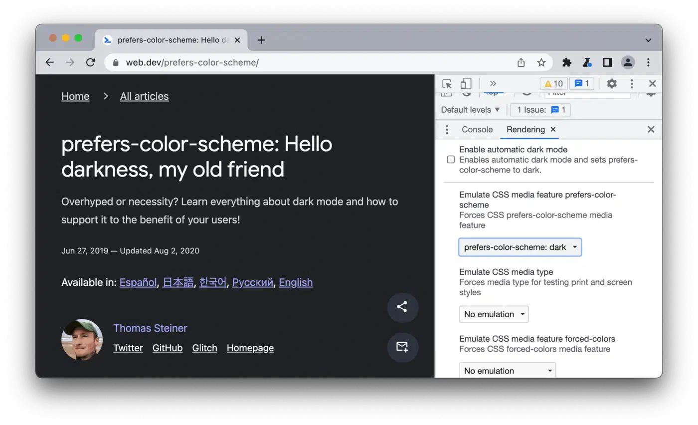
Firefox DevTools has the same toggle in the Inspector toolbar: a small sun and moon icon next to the responsive design mode button.
Safari on macOS lets you flip dark mode fast through System Settings > Appearance. That is quick enough for spot-checks while you build.
Contrast Ratio Checking
The most common dark mode failure is weak contrast on secondary text. Many developers pick a mid-gray like #6b7280 for secondary text in light mode, where it hits around 4.6:1 against white and passes WCAG AA. Then they either forget to change it in dark mode or pick a value that fails against a dark background.
Run a Lighthouse accessibility audit while you emulate dark mode in DevTools. Lighthouse flags any text that fails the 4.5:1 ratio needed for normal text (WCAG AA) or 3:1 for large text. Pay close attention to:
- Placeholder text in form inputs
- Disabled button states
- Helper text beneath form fields
- Figure captions rendered as visible text
Cross-Browser Verification for CSS Color Level 5
If you use color-mix() or relative color syntax, check both across browsers. Here is the support matrix in 2026:
| Feature | Chrome | Firefox | Safari |
|---|---|---|---|
color-mix() | 119+ | 128+ | 17.4+ |
| Relative color syntax | 119+ | 128+ | 17.4+ |
| Style container queries | 111+ | 129+ | 17.2+ |
:has() | 105+ | 121+ | 15.4+ |
Chrome’s inspector shows the computed contrast ratio when you hover over a color swatch in the Styles panel. Use this to spot-check text colors across your component library in both themes.
Zero-JavaScript and Zero-CSS Baseline
Test your site with CSS fully off. Use Firefox’s View > Page Style > No Style menu option, or a browser extension. The raw HTML should still read well: clear heading order, visible paragraph text, working links. This proves your semantic HTML base, which all CSS theming sits on.
Then test with only JavaScript disabled, through DevTools > Settings > Preferences > Debugger > Disable JavaScript. Your dark mode should stay fully working, since it needs no JavaScript at all. If something breaks, you have slipped a JS dependency in somewhere.
Pulling It Together
The CSS-first dark mode stack here is not one trick. It is an architecture. CSS Custom Properties give you the token system. The prefers-color-scheme media query gives you automatic OS-level switching. CSS Color Level 5 functions let you build coherent palettes from one brand color with math. Container style queries let you scope themes to single components. The :has() checkbox pattern gives you a manual toggle, with no persistence, for users who want to override their OS setting.
Each layer stands on its own. You can adopt the token architecture without color-mix(). You can skip container queries if your layout does not need them. You can drop the manual toggle if auto-switching on OS preference is enough for your audience.
What you get back is a dark mode that loads right on the very first paint. It works for every user on every device, with no JavaScript, no localStorage read, and no blocking script tag in your <head>. For static sites built with Hugo or any other generator, that is the right base to build on.