 Botmonster Tech
CSS Container Queries: Build Truly Responsive Components

CSS container queries
(@container) style a component by the width of its parent, not the browser viewport. Add container-type: inline-size to a parent element. Then write @container (min-width: 400px) { ... } rules on the children. Those children adapt their layout to the space they get, not the screen size. All major browsers have supported them since early 2023: Chrome 105+, Firefox 110+, Safari 16+. As of 2026 they sit at over 96% global support, per Can I Use
.
The Problem Media Queries Cannot Solve
Media queries have driven responsive web design since 2012. They work well when a component always fills the full viewport width. But they fall apart the moment you drop that component into a spot with less room.
Take a .card component built with media queries. Above 768px, it shows a horizontal layout: image on the left, text on the right. That works well in a full-width content area. But drop the same card into a 300px sidebar, and the desktop styles still apply, because the viewport is still 1200px wide. The card overflows. Text wraps in odd places. Images are too big for the space.
The usual workarounds are all fragile. BEM modifier classes like .card--sidebar and .card--main hardcode layout-specific variants. JavaScript ResizeObserver scripts watch container widths and toggle CSS classes at runtime. Some teams just write duplicate CSS rules for each context where the card might appear.
Each of these approaches ties the component tightly to its surroundings. A design system card has to work in a 12-column grid, a 4-column grid, a sidebar, a modal, and a full-width hero. With media queries, you either keep a growing list of layout variants or accept that the card only looks right in one place. If you want components you can reuse across projects and frameworks with no dependencies, see our guide on the browser’s own component model .
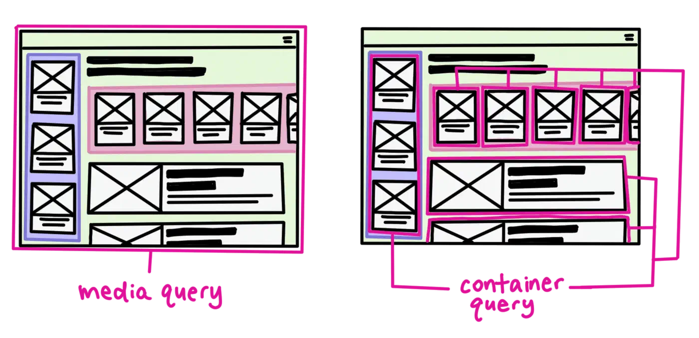
Container queries fix this at the CSS level. The component itself declares how it should look at each available width. Move the same card from a sidebar to a main content area and it adapts on its own. No class changes, no JavaScript, no layout-specific overrides. Instead of asking how wide the screen is, the component asks how much space its parent gives it. That is how frameworks like React , Vue , and Web Components already expect components to work.
Container Query Syntax and Containment Types
Container queries take a two-step setup. First declare a containment context on the parent. Then write conditional styles on the children.
Step 1 - Declare a container:
.card-wrapper {
  container-type: inline-size;
}
This tells the browser to track the inline size of .card-wrapper and make it queryable. Inline size means width in left-to-right languages. Without this line, @container rules aimed at this element do nothing at all.
Step 2 - Write container-conditional styles:
@container (min-width: 400px) {
  .card {
    grid-template-columns: 150px 1fr;
  }
}

@container (min-width: 600px) {
  .card {
    grid-template-columns: 200px 1fr;
    font-size: 1.1rem;
  }
}
The container-type property accepts three values:
| Value | Tracks | Use Case |
|---|---|---|
inline-size | Width only | 95% of responsive layouts (width-driven) |
size | Width and height | Rare cases needing height-based queries |
normal | Nothing (default) | No containment |
Stick with inline-size unless you truly need height queries. The size value turns on full containment in both axes, and that has a layout cost.

Named Containers
When layouts get complex with nested containers, names prevent ambiguity:
.sidebar {
  container: sidebar / inline-size;
}

@container sidebar (min-width: 300px) {
  .widget {
    display: grid;
    grid-template-columns: 1fr 1fr;
  }
}
The shorthand container: sidebar / inline-size sets both container-name and container-type. Without a name, @container resolves to the nearest ancestor that has containment set. That is fine for simple layouts. But it can cause surprises in deeply nested ones.
Container Query Units
Container queries also add a set of relative units scoped to the container, not the viewport:
cqw- 1% of container widthcqh- 1% of container heightcqi- 1% of container inline sizecqb- 1% of container block sizecqminandcqmax- the smaller/larger ofcqiandcqb
These work like vw/vh, but relative to the component’s container. One handy use: font-size: 3cqi scales text in step with the container width. That helps with hero cards or dashboard tiles, where text should fill the space it has.
Practical Patterns
Some UI patterns have always been hard to make responsive with media queries alone. These three are where container queries pay off the most. If you work in utilities rather than raw CSS, Tailwind v4’s container variants
expose @container out of the box, so the same patterns translate to class names.
Responsive Card
Below 300px, the card stacks vertically: image on top, text below. Between 300 and 500px, it switches to a horizontal layout. Above 500px, it shows extra metadata fields. All three layouts use the same HTML:
.card-grid {
  container-type: inline-size;
}

.card {
  display: grid;
  gap: 1rem;
}

@container (min-width: 300px) {
  .card {
    grid-template-columns: 150px 1fr;
  }
}

@container (min-width: 500px) {
  .card {
    grid-template-columns: 200px 1fr;
  }
  .card__meta {
    display: block;
  }
}
Collapsing Navigation
Put a nav component inside a container-type: inline-size parent. It then switches from horizontal links to a vertical hamburger menu based on the space it has:
.nav-container {
  container-type: inline-size;
}

.nav {
  display: flex;
  flex-direction: column;
}

@container (min-width: 600px) {
  .nav {
    flex-direction: row;
    gap: 2rem;
  }
  .nav__toggle {
    display: none;
  }
}
This works the same whether the nav sits in a full-width header or gets squeezed into a sidebar panel.

Adaptive Data Table
Wide tables show every column. At medium container widths, the less useful columns drop out. At narrow widths, the table turns into a stacked card layout using data-label attributes:
.table-wrapper {
  container-type: inline-size;
}

@container (max-width: 600px) {
  .table th.secondary,
  .table td.secondary {
    display: none;
  }
}

@container (max-width: 400px) {
  .table thead { display: none; }
  .table tr {
    display: block;
    margin-bottom: 1rem;
    border: 1px solid #ddd;
    padding: 0.5rem;
  }
  .table td::before {
    content: attr(data-label) ": ";
    font-weight: bold;
  }
}
Style Queries and What Comes Next
Beyond size queries, CSS is gaining style queries. These apply styles based on a parent’s custom property values. The syntax looks like this:
@container style(--theme: dark) {
  .card {
    background: #1a1a1a;
    color: #e0e0e0;
  }
}
Style queries for custom properties work in Chrome 111+, Edge 111+, and Safari. Firefox support should land in 2026. The payoff is component-level theming
with no class toggles. Set --density: compact on a container, and child components adjust their padding and font sizes through pure CSS.
You can also combine size and style queries:
@container (min-width: 400px) and style(--variant: featured) {
  .card {
    grid-template-columns: 1fr 1fr;
    border: 2px solid var(--accent);
  }
}
This applies styles only when the container is wide enough and has the featured flag set. You get context-aware variants that used to need JavaScript.
Performance Notes
Setting container-type: inline-size turns on size containment. The browser now knows children cannot change the parent’s inline size. That is often a speed win, because the browser can skip some layout recalcs. The size value costs more, since it needs containment in both axes. Use it only when you need height queries. Fewer surprise layout recalcs also keep visual stability in check, CLS in particular.
Polyfill for Legacy Browsers
For the roughly 4% of browsers without native support, the container-query-polyfill
from Google Chrome Labs gives you a 9KB compressed shim. It runs on ResizeObserver under the hood. The polyfill has been in maintenance mode since late 2022. It supports the full @container syntax, including container query units. Modern browsers ignore it and use native support. One caveat: the polyfill does not support Shadow DOM or calc() inside container conditions. Those edge cases rarely come up in practice.
Given the current 96%+ support, most production sites can use container queries with no polyfill. Treat the rest as a progressive enhancement case. The components still render. They just stay in their default layout, usually stacked, on browsers that lack support.