 Botmonster Tech
CSS Subgrid Reaches 92% Baseline: Align Cards Natively

CSS subgrid lets a nested grid inherit its parent’s track sizes. Child elements inside nested components line up with the parent layout. No flat HTML, no JavaScript height math, no hardcoded min-heights. It shipped in every major browser by late 2023, sits at about 92% global usage, and is safe on any modern web project today.
Ever fought a card grid where the buttons won’t line up because one card has a longer description? Subgrid is the fix you’ve been waiting for.
The Nested Alignment Problem
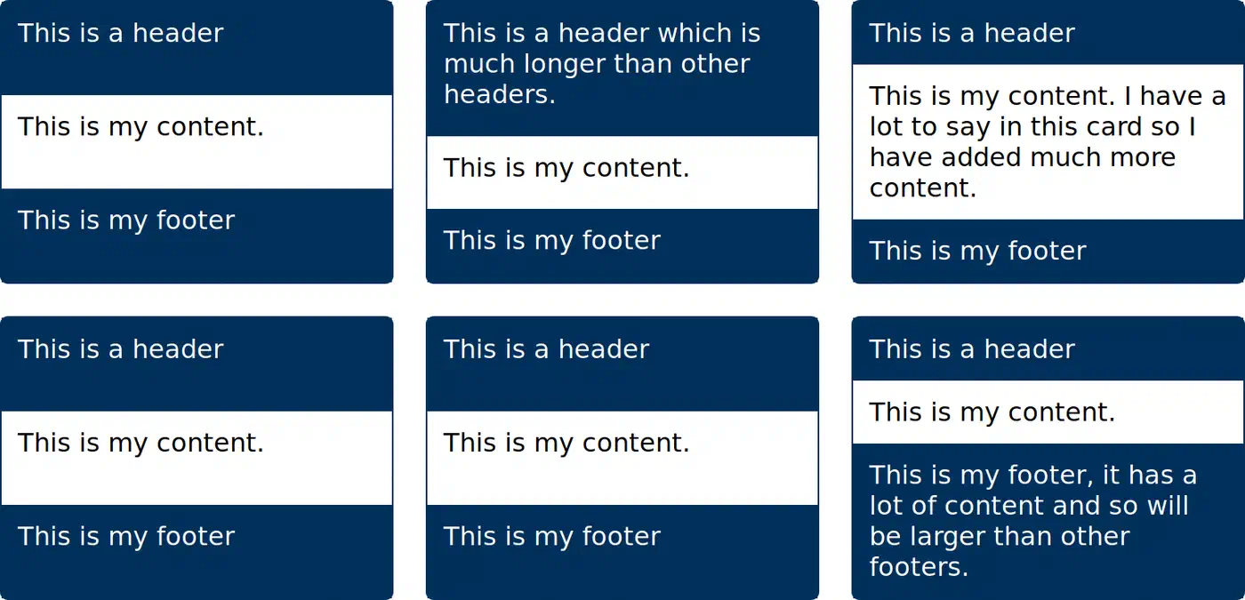
Picture a grid of product cards. Each card has a title, a description, and a button. You want all titles on one line, all descriptions on the next, and all buttons at the bottom of the row. Sounds simple. It hasn’t been.
Without subgrid, each card is its own grid or flex container. Card A’s title row only knows about Card A’s content. When Card B has a four-line description and Card A has a two-line one, Card A’s button drifts up while Card B’s button sits lower. The row looks sloppy, and it gets worse as content varies.
Devs have tried four workarounds.
The first is hardcoding min-height on the description area. It works until someone writes longer copy and breaks again.
The second is display: contents on the card wrapper. It strips the card’s box so the children join the parent grid directly. The cost: you lose the ability to style the card (no borders, no background, no padding) and the accessibility tree takes a hit from old buggy builds.
The third is flat HTML, where every title, description, and button is a direct child of the parent grid. This wrecks the semantic structure and falls apart inside frameworks like React, Vue, or Svelte.
The fourth is JavaScript height matching: measure every element after render and force them to match. It’s fragile, it triggers layout shifts, and it breaks during server-side rendering.
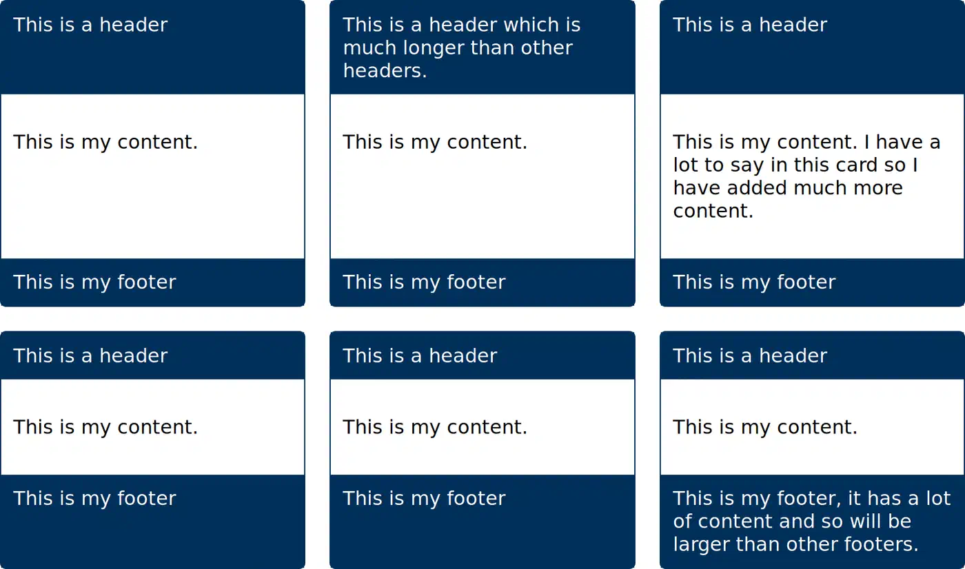
Subgrid clears all of this. Each card inherits the parent’s row tracks, so every title sits on row 1, every description on row 2, and every button on row 3. The HTML stays clean, the a11y tree stays intact, and the browser’s layout engine does the work at native speed.
How Subgrid Actually Works
A subgrid is a grid item that is also a grid container. Instead of setting its own track sizes, it borrows them from its parent. The syntax is one keyword:
.child {
  display: grid;
  grid-template-columns: subgrid;
  grid-template-rows: subgrid;
}
When the browser sees subgrid on grid-template-columns or grid-template-rows, it looks at the parent grid and reuses those tracks for the child. The child spans some of the parent’s columns or rows via the usual grid-column and grid-row props. The child’s own items then snap to the parent’s track lines inside that span.
A few details worth knowing:
- You can subgrid in one dimension only. It’s common to inherit columns from the parent while you set your own rows, or vice versa. For a card grid, you usually want to inherit rows.
- Named grid lines pass through. If the parent defines
[col-start] 1fr [col-end], the subgrid can callcol-startandcol-enddirectly. That helps a lot in large layouts with meaningful line names. - Gap is inherited by default. The subgrid picks up the parent’s
gap,column-gap, androw-gap. You can override any of them with a local rule. - Implicit tracks are off in the subgridded dimension. If a subgrid covers three parent rows and you try to drop in a fourth item, the browser won’t add a new row for it. Leave the other dimension as a regular grid if you need implicit growth.
- Line numbers restart inside the subgrid. Line 1 of the subgrid is the first line it covers on the parent, not the parent’s line 1.
See the full spec in the MDN subgrid guide for the details.
A Working Card Grid Example
Here’s the classic card-grid pattern, written out in full. The parent grid sets three columns and lets rows size themselves. Each card is a subgrid spanning three parent rows: one for the title, one for the description, one for the button.
<section class="card-grid">
  <article class="card">
    <h3>Fast Setup</h3>
    <p>Get started in under a minute with a single command.</p>
    <a href="#" class="cta">Read more</a>
  </article>
  <article class="card">
    <h3>Built for Teams</h3>
    <p>Collaborate on projects with shared workspaces, fine-grained permissions, and audit logs for every change.</p>
    <a href="#" class="cta">Read more</a>
  </article>
  <article class="card">
    <h3>Open Source</h3>
    <p>Every line of code is public.</p>
    <a href="#" class="cta">Read more</a>
  </article>
</section>.card-grid {
display: grid;
grid-template-columns: repeat(3, 1fr);
grid-auto-rows: auto;
gap: 1.5rem;
}
.card {
display: grid;
grid-template-rows: subgrid;
grid-row: span 3;
padding: 1.5rem;
border: 1px solid #ddd;
border-radius: 8px;
}
@media (max-width: 900px) {
.card-grid { grid-template-columns: repeat(2, 1fr); }
}
@media (max-width: 600px) {
.card-grid { grid-template-columns: 1fr; }
}Two lines do all the work: grid-template-rows: subgrid and grid-row: span 3. The card spans three rows on the parent. Those rows size themselves to the tallest title, the tallest description, and the tallest button in the row. Shorter cards get padded with whitespace so their buttons drop to the shared baseline.
This works at every breakpoint because the parent grid always has rows, no matter how many columns it shows. On mobile with one column, every card is still a subgrid of its row, so nothing breaks.
Beyond Cards: Forms, Sidebars, and Pricing Tables
Card grids get most of the press, but the pattern fits anywhere a nested piece needs to line up with an outer layout.
Form layouts are the next obvious fit. You have label-input pairs
where labels vary in width, and you want every input to start at the same spot. The old fixes are a table, a fixed label width, or flexbox with hand-set flex-basis values. With subgrid, you set up a two-column parent grid and let each form group subgrid into it:
.form {
  display: grid;
  grid-template-columns: max-content 1fr;
  gap: 0.5rem 1rem;
}

.form-group {
  display: grid;
  grid-template-columns: subgrid;
  grid-column: 1 / -1;
}
Every label sizes itself to max-content. The widest label sets the first column, and every input starts at the same spot. Wrapping each pair in a .form-group keeps the markup semantic and lets you style groups as units.
Sidebar and main-content layouts gain too. If your page has a grid-template-columns: 240px 1fr shell, nested parts inside the main area can inherit the column tracks and line up with the sidebar edge without knowing its width. Change the sidebar width once in the parent, and every nested part follows. For parts that also need to respond to their own box’s width rather than the viewport
, that capability pairs well with subgrid.
Pricing tables with three tiers usually have a header, a feature list, a price, and a CTA button per tier. Lining up the price row and CTA row across tiers is the same problem as the card grid, solved the same way. The feature list rows can also subgrid, so each feature bullet lands on the same line across all tiers. You get a real comparison table without a <table> element.
Dashboard panels with mixed widget shapes gain from column subgridding. If the outer grid sets twelve columns, single widgets can grab a span of four or six and subgrid columns to keep inner alignment in sync with the page rhythm.
Subgrid vs. the Old Workarounds
Lined up against the old fixes, the trade-offs get clear:
| Approach | Preserves HTML | Accessible | No JavaScript | Performance | Works in SSR |
|---|---|---|---|---|---|
| Subgrid | Yes | Yes | Yes | Native layout engine | Yes |
display: contents | Yes | Partially (known bugs) | Yes | Native | Yes |
| Flattened HTML | No | Yes | Yes | Native | Yes |
| JS height equalization | Yes | Yes | No | Slower, layout shifts | No |
| Hardcoded min-heights | Yes | Yes | Yes | Native | Yes (but breaks easily) |
display: contents looked like the answer for a while. But it has long had a11y bugs in Chromium and Safari where the collapsed element stops exposing ARIA roles. Those bugs are partly fixed now. Subgrid sidesteps the issue by keeping the card’s box in the DOM. Flat HTML breaks inside frameworks. JavaScript matching costs you CPU time on every resize. Min-heights fall apart the moment content changes, which it always does.
Skip subgrid in one case: when the nested piece really has its own layout and doesn’t need to line up with the parent. A self-contained widget that sets its own rhythm works better as a plain grid, free of the coupling subgrid adds.
Browser Support and Fallbacks
Subgrid has reached Baseline Widely Available status. That means it’s been in every major browser long enough to count as boring and safe. Here’s the current state:
| Browser | Version with subgrid | Released |
|---|---|---|
| Firefox | 71+ | December 2019 |
| Safari | 16+ | September 2022 |
| Chrome | 117+ | September 2023 |
| Edge | 117+ | September 2023 |
| Samsung Internet | 24+ | Late 2023 |
Global usage sits near 92%, and that number climbs as users update their browsers. For any new project aimed at modern users, subgrid is the default pick. Data lives on caniuse.com if you need to check your specific audience.
For the remaining slice of older browsers, feature detection is straightforward:
.card {
  display: grid;
  grid-template-rows: auto 1fr auto;
}

@supports (grid-template-rows: subgrid) {
  .card {
    grid-template-rows: subgrid;
    grid-row: span 3;
  }
}
The fallback gives each card its own three-row grid, with the description area taking the flexible 1fr space. Cross-card alignment is lost, but each card still looks correct on its own. Users on supporting browsers get the full aligned view. No subgrid polyfill exists, and none can exist: it’s a layout engine feature, not something you can shim in JavaScript. The same @supports pattern works when you place popups with CSS anchor positioning for tooltips and dropdowns
, another layout-engine feature with a clean static fallback.
If your audience still has IE11 or very old Safari, skip subgrid. Fall back to flexbox with a matched set of min-heights, or take the JavaScript matching cost.
DevTools Support for Debugging
Chrome and Firefox DevTools both ship with subgrid overlays. That makes debug work far easier than squinting at the DOM.
In Chrome, elements with display: grid get a small “grid” badge in the Elements panel. Subgrids get a matching badge you can click to toggle an overlay showing the inherited track lines.
Firefox nests subgrids under their parent in the Grid Inspector panel. Pick a subgrid and the parent’s overlay shows up too, so you can see how the nested tracks line up.
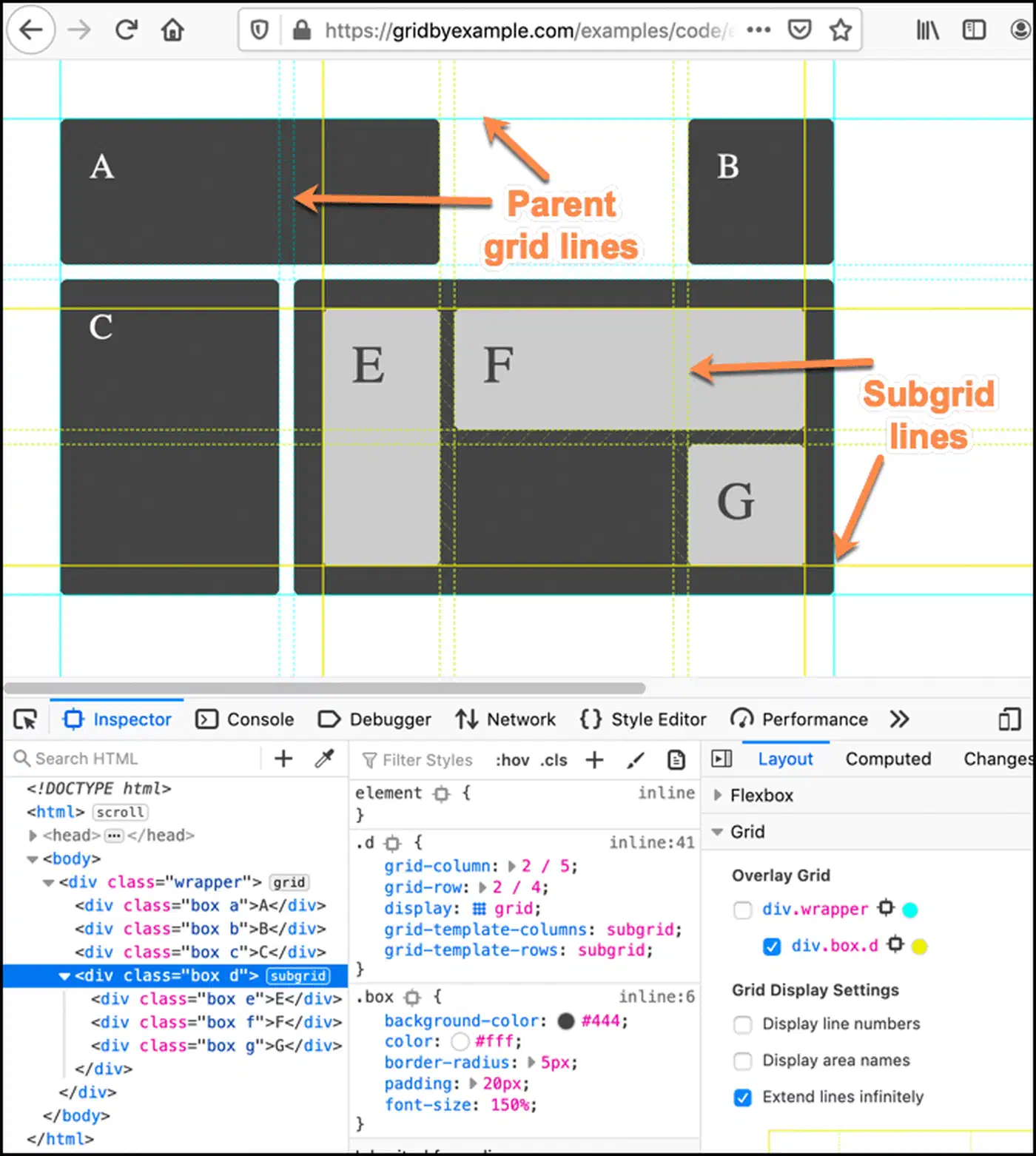
If a card seems to ignore the subgrid, the overlay almost always tells you why: the card spans the wrong number of rows, or the parent grid doesn’t have the rows you thought. Much faster than adding background colors to guess what’s happening.
When to Reach for Subgrid
A quick rule of thumb: if you have nested parts that need to line up with an outer layout, subgrid is the right tool. Card grids with matching baselines, forms with mixed label widths, pricing tables with feature rows, dashboard widgets that hold a column rhythm. Any layout where “these things should line up” is a hard rule. If the nested layout is fully on its own and doesn’t need to sync with anything outside, stick with plain grid or flexbox.
If you build with utility classes, grid-rows-subgrid ships as a first-party utility once you upgrade to Tailwind CSS v4
.
Picking up subgrid usually makes code simpler, not harder. You can delete JS measurement loops, remove min-height hacks, and drop display: contents workarounds. Swap all of them for one or two CSS lines. The HTML gets cleaner, the a11y tree stays intact, and the layout acts the way you meant from the start.