 Botmonster Tech
The HTML popover attribute nobody warned you about just killed your modal JS

The HTML popover attribute gives you dropdown menus, tooltips, and lightweight modals using nothing but markup and CSS. No JavaScript library, no React state, no z-index: 99999 hacks. A <button popovertarget="menu"> paired with a <div popover id="menu"> handles top-layer rendering, light-dismiss on outside clicks, Escape to close, and basic focus moves. It is all built into the browser. The Popover API is a Baseline feature in Chrome 114+, Firefox 132+, Safari 17+, and Edge 114+, covering over 91% of browser traffic.
Pair it with CSS anchor positioning (now at 85% global support) and the :popover-open pseudo-class. Together they replace the heavy JavaScript popover libraries that have ruled frontend code for the past decade.
Why Native Popovers Win
Before the popover attribute, a dropdown menu took a lot of plumbing. You needed a positioning library like Floating UI to work out where the menu should appear. You needed click-outside detection with document.addEventListener('click', ...) and manual cleanup to dodge memory leaks. You also needed z-index games to keep the menu above other content. Those games broke any time a parent had overflow: hidden or a CSS transform that made a new stacking context. The same era leaned on jQuery plugins for every interactive piece, from carousels to a paging plugin like bootpag for paged lists, each one another dependency to load and keep current.
The popover attribute solves these problems at the browser level:
- Popovers paint in the browser’s top layer, the same layer used by
<dialog>and fullscreen elements. They escapeoverflow: hidden, stacking contexts, and transformed ancestors. The z-index wars are over. - With
popover="auto", a click outside or an Escape press closes the popover for you. The browser tracks nested popovers so they don’t close each other by mistake. - Focus moves into the popover on open and back to the invoker on close. The browser also wires up
aria-expandedwhen you usepopovertarget, so you get accessibility for free. <button popovertarget="menu">is declarative. Noonclickhandler, nouseState, no ref forwarding. The button knows which popover it owns and toggles it on click.- A typical Floating UI plus Headless UI plus React popover stack ships 15 to 30 KB of minified JavaScript. The native attribute ships 0 KB.
Progressive enhancement is easy too. Browsers that don’t understand popover render the element as a plain <div>. You can keep it hidden with a [popover]:not(:popover-open) { display: none; } fallback.
The Three Modes: auto, manual, and hint
The popover attribute takes three values. Each has its own dismissal and stacking rules. Picking the wrong one is the top source of bugs.
auto (the default)
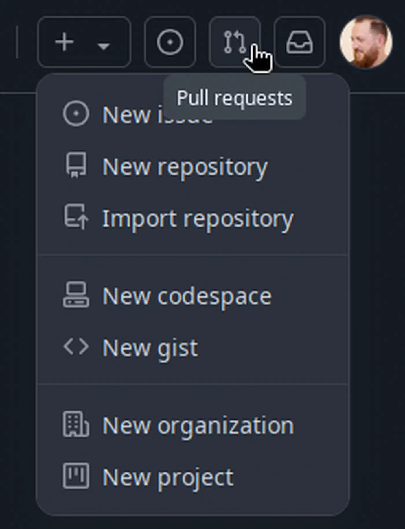
Setting popover or popover="auto" gives you the standard popover. It supports light-dismiss (a click outside closes it) and responds to Escape. It also enforces a stack rule: opening one auto popover closes any sibling auto popovers that are not ancestors. This is the mode you want for dropdown menus, select-like pickers, and share sheets.
<button popovertarget="user-menu">Account</button>
<div popover id="user-menu" role="menu">
  <button role="menuitem">Profile</button>
  <button role="menuitem">Settings</button>
  <button role="menuitem">Sign Out</button>
</div>
Nested auto popovers stay open because the browser tracks the ancestor chain through popovertarget and the DOM tree. Open child popovers from buttons inside the parent. If you trigger them from unrelated DOM nodes, the nesting link breaks.
manual
popover="manual" turns off light-dismiss for good. No Escape key, no click-outside close, no stack rule. You have to call .hidePopover() yourself or wire up a close button. Use this for toast notifications, sticky side panels, and anything that should stay open until the user dismisses it.
<div popover="manual" id="toast" role="status">
  File saved successfully.
  <button popovertarget="toast" popovertargetaction="hide">Dismiss</button>
</div>
Many manual popovers can be open at once without stepping on each other.
hint (new in 2026)
popover="hint" is the dedicated tooltip mode, added in Chrome 133 and rolling out across browsers through 2026. The key difference: opening a hint popover does not close auto popovers. If you used popover="auto" for a tooltip, hovering a help icon would close the user’s open dropdown menu. That’s a terrible experience. The hint mode fixes it with a separate stack.
| Behavior | auto | hint | manual |
|---|---|---|---|
| Light-dismiss | Yes | Yes | No |
| Closes other auto popovers | Yes | No | No |
| Closes other hint popovers | Yes | Yes | No |
| Escape key closes | Yes | Yes | No |
| Multiple open simultaneously | Only ancestors | Only one hint | Unlimited |
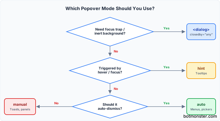
Hints are typically triggered by hover and focus rather than clicks:
<button id="help-btn" aria-describedby="help-tip"
  onmouseenter="document.getElementById('help-tip').showPopover()"
  onmouseleave="document.getElementById('help-tip').hidePopover()">
  ?
</button>
<div popover="hint" id="help-tip" role="tooltip">
  Keyboard shortcut: Ctrl+S
</div>
Imperative control
All three modes support showPopover(), hidePopover(), and togglePopover(). The beforetoggle and toggle events fire around state changes. They’re handy for analytics or animation triggers:
menu.addEventListener('toggle', (e) => {
  if (e.newState === 'open') {
    menu.querySelector('[role="menuitem"]').focus();
  }
});
Real Examples: Dropdown, Tooltip, and Confirmation Modal
Dropdown menu
The popover attribute handles open, close, and dismiss for free. Arrow-key navigation inside the menu still needs a few lines of JavaScript. The browser does not yet handle role="menu" keyboard patterns on its own. Even so, that’s a fraction of what a full library took.
<button popovertarget="file-menu">File</button>
<div popover id="file-menu" role="menu">
  <button role="menuitem" tabindex="0">New</button>
  <button role="menuitem" tabindex="-1">Open</button>
  <button role="menuitem" tabindex="-1">Save</button>
  <hr>
  <button role="menuitem" tabindex="-1">Export as PDF</button>
</div>
Tooltip with hint mode
<span id="anchor" aria-describedby="tip">API rate limit</span>
<div popover="hint" id="tip" role="tooltip">
  60 requests per minute per API key.
</div>

<script>
const anchor = document.getElementById('anchor');
const tip = document.getElementById('tip');
anchor.addEventListener('mouseenter', () => tip.showPopover());
anchor.addEventListener('mouseleave', () => tip.hidePopover());
anchor.addEventListener('focus', () => tip.showPopover());
anchor.addEventListener('blur', () => tip.hidePopover());
</script>Confirmation modal with dialog
When you need a true modal with a focus trap, an inert background, and a ::backdrop overlay, use <dialog> instead of popover. The new closedby attribute ships in Chrome 134+ and is part of Interop 2026. It adds light-dismiss to dialogs:
<dialog id="confirm" closedby="any">
  <h2>Delete this file?</h2>
  <p>This action cannot be undone.</p>
  <form method="dialog">
    <button value="cancel">Cancel</button>
    <button value="confirm">Delete</button>
  </form>
</dialog>
Dialogs give you modality: the background goes inert and you can’t click through it. Popovers do not. Use popover for non-blocking UI such as menus, tooltips, and toasts. Use <dialog> for confirmations and forms that must stop the user.
Styling with :popover-open and @starting-style
The :popover-open pseudo-class targets popovers in their open state. Pair it with @starting-style, supported in Chrome 117+, Firefox 129+, and Safari 17.5+. You can then animate the move from display: none to visible:
[popover] {
  opacity: 0;
  transform: translateY(-8px);
  transition: opacity 200ms, transform 200ms,
              display 200ms allow-discrete;
}

[popover]:popover-open {
  opacity: 1;
  transform: translateY(0);
}

@starting-style {
  [popover]:popover-open {
    opacity: 0;
    transform: translateY(-8px);
  }
}
The transition-behavior: allow-discrete property (written inline as display 200ms allow-discrete) makes display: none something you can transition. Before this, you needed JavaScript timer hacks to pull it off.
Form participation
A popover with form fields submits with the surrounding <form> as normal. There is no portal or shadow DOM line to break the form tree. React library solutions often teleport the popover content to the document body, which breaks form submission along the way. Those fields still need the same accessibility care every form input deserves, so apply it to the inputs inside a popover too.
Integrating CSS Anchor Positioning
Popovers solved the “render above everything” problem. They did not solve the “position next to the trigger” problem. CSS anchor positioning fills that gap. It landed in Chrome 125, Edge 125, Firefox 147, and Safari 26, and now reaches 85% of global browser traffic.
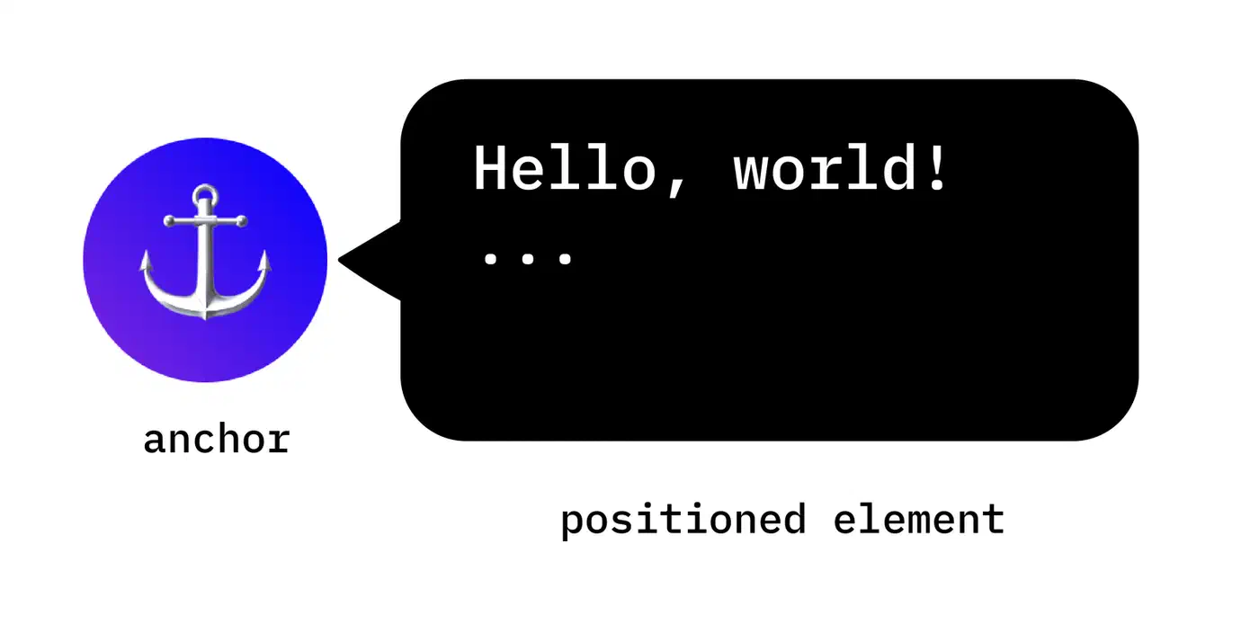
Name an element as an anchor. Then tell the popover to sit relative to that anchor:
/* Name the trigger as an anchor */
#account-btn {
  anchor-name: --account-btn;
}

/* Position the popover relative to the anchor */
#user-menu {
  position: fixed;
  position-anchor: --account-btn;
  position-area: bottom span-right;
  margin-top: 4px;
}
position-area: bottom span-right is the CSS equivalent of Floating UI’s placement: 'bottom-start', but with zero runtime cost.
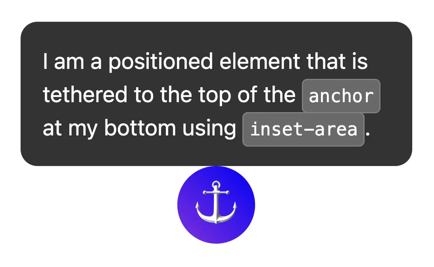
Flip behavior with position-try-fallbacks
When a popover would overflow the viewport, position-try-fallbacks gives the browser a list of fallback placements to try on its own. It’s the native form of Floating UI’s flip() middleware:
#user-menu {
  position-try-fallbacks: --top-placement;
  position-try-order: most-height;
}

@position-try --top-placement {
  position-area: top span-right;
  margin-bottom: 4px;
}
Matching trigger width with anchor-size()
For custom <select>-style pickers, anchor-size() makes the dropdown match its trigger’s width:
#dropdown-menu {
  width: anchor-size(--trigger width);
}
Fallback strategy
For browsers that have not yet shipped anchor positioning, use position: absolute inside a positioned wrapper. Or feature-detect with JavaScript:
if (!CSS.supports('anchor-name', '--x')) {
  // Load a minimal positioning shim
}
Replacing Floating UI, Headless UI, and Bootstrap Dropdowns
Most teams still pull in heavy deps for popover code out of habit. Here is how the common libraries map to native features, and what you can drop.
Bootstrap 5 dropdowns
Swap data-bs-toggle="dropdown" and .dropdown-menu for popovertarget and popover. Bootstrap’s Popper.js dependency for positioning maps to a native CSS positioning model. If you use Bootstrap only for dropdowns, you can drop the whole Bootstrap JavaScript bundle.
Headless UI Popover and Menu
The React <Popover> and <Menu> components turn into a plain <button popovertarget> plus a <div popover>. You lose Headless UI’s transition helpers. But @starting-style gives you the same entry and exit animations in pure CSS.
Floating UI
The runtime middleware stack maps to CSS properties:
| Floating UI Middleware | CSS Equivalent |
|---|---|
offset() | margin on the popover |
flip() | position-try-fallbacks |
shift() | position-area variants |
size() | anchor-size() |
Keep Floating UI only for the odd custom placement that CSS cannot do. Arrow math, for example, still gains from JavaScript.
Radix UI
Radix UI Popover and Tooltip primitives map straight across: use popover="auto" for the popover primitive and popover="hint" for the tooltip. The @radix-ui/react-popover package alone weighs about 91 KB unpacked. All of that vanishes when you switch to the native attribute.
Framework interop
The popover attribute is standard HTML, so it works inside any framework. In React 19, use camelCase props: popoverTarget and popoverTargetAction on the invoker button. Vue and Svelte pass the attributes through as is, since they don’t change HTML attributes. For teams that want to push native primitives further, you can wrap popover-based UI in shadow DOM and ship it as a reusable element. They work across any framework with no build step.
Migration checklist
- Audit existing popovers for modality needs. Anything that needs a focus trap or inert background should move to
<dialog closedby="any">. - Sort the rest as menu, tooltip, or toast.
- Match each group to the right mode:
autofor menus,hintfor tooltips,manualfor toasts. - Swap the JavaScript open/close handlers for
popovertarget. - Swap Floating UI or Popper.js positioning for CSS anchor positioning.
- Delete the library imports and measure the bundle size drop.
Typical migrations cut 20 to 60 KB of JavaScript per route. They also report faster Time to Interactive and fewer hydration mismatches, since the open/closed state no longer lives on both server and client. Teams that push further pair native popovers with small interactivity libraries. That combo handles the rest of the interactive patterns, like form submission and dynamic content loading, without adding a full frontend framework.
Browser Support Reference
Current support:
| Feature | Chrome | Firefox | Safari | Edge |
|---|---|---|---|---|
popover (auto/manual) | 114+ | 132+ | 17+ | 114+ |
popover="hint" | 133+ | Rolling out | Rolling out | 133+ |
:popover-open | 114+ | 132+ | 17+ | 114+ |
@starting-style | 117+ | 129+ | 17.5+ | 117+ |
| CSS Anchor Positioning | 125+ | 147+ | 26+ | 125+ |
<dialog closedby> | 134+ | Supported | Interop 2026 | 134+ |
The core popover attribute covers over 91% of global browser traffic. CSS anchor positioning is at 85% and climbing. For the rest, the fallback is clean: popovers drop to hidden <div> elements you can style with CSS. Positioning falls back to position: absolute inside a wrapper.
What Is Coming Next
The Interest Invokers API (interesttarget, now renamed to interestfor) will let you declare hover and focus-triggered popovers fully in HTML. That removes the need for the mouseenter and mouseleave JavaScript shown in the tooltip example above. The attribute is still under test, sits behind a flag in Chrome Canary, and the API shape is still in flux. It is not ready for production yet. But once it lands, the tooltip example will shrink to:
<button interestfor="tip">API rate limit</button>
<div popover="hint" id="tip" role="tooltip">
  60 requests per minute per API key.
</div>
No JavaScript at all, and no library dependency.
The native popover attribute, paired with CSS anchor positioning and @starting-style, already covers most dropdown, tooltip, and lightweight modal needs you’ll hit. The remaining gaps are arrow-key navigation inside menus and hover-intent triggering. Both are active spec work. For any new project in 2026, try the native approach first, before you reach for a positioning library.