 Botmonster Tech
Designing a Professional Home Assistant Dashboard with CSS

A professional Home Assistant
dashboard uses custom CSS Grid layouts and HACS cards like button-card to build responsive, mobile-first interfaces. Moving past the default grid lets you design a “control center” that looks like a native high-end app, not a scrolling list of toggles. This guide walks through every layer of that change. It covers why the default UI falls short, the CSS Grid basics you need, how to build a clean theme, how to structure room-based navigation, and how to make it all work well on the HA Companion App.
Prerequisites: You need HACS
(Home Assistant Community Store) installed, card-mod and button-card installed via HACS, and Home Assistant 2024.1 or later. All YAML examples below are copy-pasteable into the Lovelace raw YAML editor or ui-lovelace.yaml.
Why the Default Lovelace UI Falls Short
The Lovelace dashboard that ships with Home Assistant works fine. For a first-time user, it gives a ready-made structure with entity cards, glance cards, and a sensor-friendly grid. But “functional” and “polished” are not the same thing. Power users hit the limits of the default layout fast.
The default Lovelace grid uses a fixed 4-column layout inside. You can change the number of columns in a given view. But you cannot override the grid engine itself without custom code. So you cannot force a camera feed to span exactly two columns and two rows while four sensor tiles sit next to it. Not without fighting the defaults at every step.
Mobile support is an afterthought in default layouts. The standard Lovelace view just reflows cards in a line on small screens. On a phone, that gives you a huge vertical scroll. The gap between HA’s default UI and commercial apps like Apple Home or Google Home has only grown. Those platforms spend heavily on polished, adaptive interfaces. HA hobbyists can now match them, but only with custom CSS.
HA gives you three main CSS injection paths. card-mod is the most practical. It injects CSS straight into any card’s shadow DOM via a card_mod: key in YAML. layout-card replaces the Lovelace grid engine itself. The frontend_extra_module_url option in configuration.yaml lets you load a custom JavaScript or CSS module across the whole site. That is useful for theme-level overrides the built-in theme system cannot reach. For most users, card-mod and layout-card together cover 95% of use cases.
Essential HACS Cards and Tools
A small set of HACS frontend cards forms the base of every serious HA dashboard. Knowing which ones are kept up to date, and which work well with CSS, saves you hours of trial and error.
button-card
is the most flexible card in the HA ecosystem. It supports Jinja2 templates run at render time, per-state custom CSS and icons, and color shifts when an entity changes state. Its rich styles: block gives you direct access to the card’s inner CSS. If you install only one HACS card for dashboard work, make it this one.
card-mod
is the gateway to deep visual control. It injects styles into a card’s shadow DOM. The shadow DOM is the style boundary that normally stops outside CSS from reaching inside a web component. With card-mod you can target inner parts of any standard or custom card. You add the card_mod: key right to a card’s YAML, and it takes a style: string of plain CSS.
mushroom-cards
ship with Material Design 3 defaults that look great right away. The catch is that the CSS override points are kept narrow on purpose, so it stops things from breaking. Heavy custom work can then feel like a fight. They are great for quick wins, but button-card suits fully custom layouts better.
layout-card solves the grid engine problem outright. It swaps the Lovelace grid for a configurable CSS Grid or Masonry layout. You can then set exact column templates, row heights, and named grid areas. Those are the same tools web developers use for production interfaces.
stack-in-card
and the built-in grid-card (available since HA 2023.3) let you group cards together with no borders or gaps. stack-in-card strips the default background and border radius from nested cards, so you get seamless compound layouts. To do the reverse and keep a nested card’s own background, shadow, or rounded corners, add a keep: block to the stack-in-card config. Set keep: {background: true, border_radius: true, box_shadow: true} to preserve styling on every child card, or set --keep-background: 'true' inside a single card’s styles: to keep just that one card untouched.
CSS Grid Fundamentals for Dashboard Design
CSS Grid is the layout tool that makes professional HA dashboards possible. If you have never used it, the parts you need for dashboards fit on one page.
The most useful single line for responsive tile grids is:
display: grid;
grid-template-columns: repeat(auto-fill, minmax(200px, 1fr));
gap: 12px;
repeat(auto-fill, minmax(200px, 1fr)) tells the browser to fit as many columns as it can. Each column is at least 200px wide but grows to share space evenly. On a wide desktop monitor you get five or six columns. On a phone held upright you get two. This one line gives you responsive layouts with no media query breakpoints.
For tighter control, such as placing a camera feed across two rows while four sensor tiles sit beside it, use named grid areas:
grid-template-areas:
  "camera camera sensors-a sensors-b"
  "camera camera sensors-c sensors-d";
grid-template-columns: 1fr 1fr 1fr 1fr;
grid-template-rows: 160px 160px;
Each card then gets its area name via grid-area: camera; or grid-area: sensors-a;. In layout-card this maps to the layout: key in the card’s YAML. The result is pixel-precise placement that holds up well when you resize the window.
Visual polish comes from three CSS properties used the same way each time. gap sets the space between grid cells: 12 to 16px reads as “card UI” on desktop, 8px on mobile. padding inside each card gives the content breathing room. border-radius creates the rounded-rectangle “card” shape that defines modern app design. Stick to one border radius across the whole dashboard. 12px is a common default that feels neither boxy nor too pill-shaped.
CSS Custom Properties, also called variables, keep a dashboard consistent. Home Assistant already exposes 40+ variables you can use anywhere. The most useful ones for theming:
| Variable | Default role |
|---|---|
--primary-color | Action buttons, highlights |
--card-background-color | Card fill |
--primary-text-color | Main labels |
--secondary-text-color | Subtitles, metadata |
--disabled-text-color | Off-state labels |
--ha-card-border-radius | Card corner radius |
--ha-card-box-shadow | Card elevation shadow |
When you override these variables in your theme file, the change flows to every card that uses them, built-in cards included. You never touch a single card config.
Theming: Colors, Typography, and Dark Mode
Home Assistant’s built-in theme system is the cleanest place to set a consistent visual identity. A theme is a YAML map under frontend: in configuration.yaml. It sets CSS variable values across the whole site. Once you pick a theme on the user profile page, or set it with frontend.set_theme, its variables override the defaults in every view.
Create a theme file at config/themes/my_dark_theme.yaml and reference it in configuration.yaml:
# configuration.yaml
frontend:
  themes: !include_dir_merge_named themes/
A minimal theme file overriding the palette looks like this:
# themes/my_dark_theme.yaml
my-dark-pro:
  primary-color: "#4FC3F7"
  card-background-color: "#1E1E2E"
  primary-text-color: "#CDD6F4"
  secondary-text-color: "#A6ADC8"
  ha-card-border-radius: "12px"
  ha-card-box-shadow: "0 4px 24px rgba(0,0,0,0.4)"
  paper-card-background-color: "#1E1E2E"
For typography, you can load a custom font via @import with a custom_ui: entry, or inject it through frontend_extra_module_url. Google Fonts works. But on a self-hosted setup, a variable font served from config/www/ is better for speed and privacy:
# In your theme YAML
font-family: "'Inter Variable', system-ui, sans-serif"
Then place the font file in config/www/fonts/ and call it from a CSS @font-face block loaded via frontend_extra_module_url.
You can handle dark mode in HA two ways. The first is to define two themes and use an automation to switch between them based on sun.sun state. It is simple and reliable. The second uses the prefers-color-scheme media query inside a module loaded via frontend_extra_module_url. HA’s own dark mode toggle also adds a dark class to the body element. You can target that class in custom CSS, so one theme file adapts on its own:
/* Loaded via frontend_extra_module_url */
:root {
  --card-background-color: #F5F5F5;
  --primary-text-color: #1A1A2E;
}

:root.dark {
  --card-background-color: #1E1E2E;
  --primary-text-color: #CDD6F4;
}
Building a Room-Based Navigation Layout
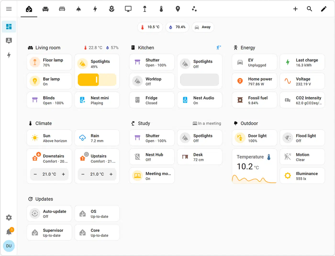
The clearest dashboard structure mirrors how people use their home: by room. Sorting by device type, with all lights on one tab and all sensors on another, forces the user to think like a database admin. Sorting by room (“Living Room,” “Kitchen,” “Office”) maps to how people move through space.
The “room card” pattern uses a single button-card to show the room name, active device count, and current temperature at a glance. Here is a full, copy-pasteable template:
type: custom:button-card
entity: light.living_room_group
name: Living Room
show_state: false
show_icon: true
icon: mdi:sofa
tap_action:
  action: navigate
  navigation_path: /lovelace/living-room
hold_action:
  action: more-info
custom_fields:
  active_count:
    card:
      type: custom:button-card
      entity: sensor.living_room_active_devices
      show_name: false
      show_icon: false
      show_state: true
      styles:
        card:
          - background: none
          - border: none
          - padding: 0
        state:
          - font-size: 11px
          - color: var(--secondary-text-color)
  temperature:
    card:
      type: custom:button-card
      entity: sensor.living_room_temperature
      show_name: false
      show_icon: false
      show_state: true
      styles:
        card:
          - background: none
          - border: none
          - padding: 0
        state:
          - font-size: 11px
          - color: var(--secondary-text-color)
styles:
  card:
    - border-radius: 12px
    - padding: 16px
    - background: var(--card-background-color)
    - box-shadow: 0 4px 24px rgba(0,0,0,0.3)
  name:
    - font-size: 15px
    - font-weight: 600
    - color: var(--primary-text-color)
  icon:
    - width: 32px
    - color: >-
        [[[ return entity.state === 'on' ? 'var(--primary-color)' : 'var(--disabled-text-color)'; ]]]
state:
  - value: "on"
    styles:
      card:
- border-left: 3px solid var(--primary-color)The navigate: action in button-card’s tap_action links each room card to its own Lovelace sub-view. You define sub-views in ui-lovelace.yaml, or in the UI as extra views with a URL path set, such as /lovelace/living-room. This gives you a clean hub-and-spoke layout. The main view is a grid of room cards, and each room opens its own detailed view. A room view is also the right home for media controls, like the per-room volume sliders that come with a room-by-room Snapcast install
.
If you want a more spatial approach, the picture-elements card lets you use a floor plan image as the top-level navigation. Drop state-icon elements at the coordinates of each room, and add navigate actions for taps. The effect is an interactive floor plan where glowing icons show active devices.
For responsive stacking, set layout-card in the main view to show room cards in a 3-column grid on desktop and a single column on mobile:
type: custom:layout-card
layout_type: custom:grid-layout
layout:
  grid-template-columns: repeat(auto-fill, minmax(220px, 1fr))
  grid-gap: 12px
  padding: 16px
You need no JavaScript or media query work. auto-fill handles the reflow on its own.
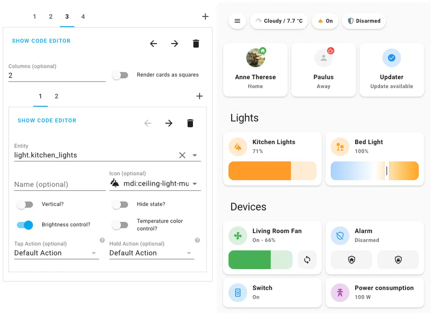
Using card-mod to Override Shadow DOM Styles
card-mod is the tool you reach for when a card’s built-in style options are not enough. Here is a concrete example. It overrides the header text color and removes the divider line from a standard entities card.
type: entities
title: Office Sensors
entities:
  - sensor.office_temperature
  - sensor.office_humidity
  - sensor.office_co2
card_mod:
  style: |
    ha-card {
      background: var(--card-background-color);
      border-radius: 12px;
    }
    .card-header {
      color: var(--primary-color);
      font-size: 14px;
      font-weight: 700;
      text-transform: uppercase;
      letter-spacing: 0.08em;
      padding-bottom: 0;
      border-bottom: none;
    }
    .card-content {
      padding-top: 8px;
    }
The style: | block under card_mod: gets injected into the component’s shadow root, past the normal CSS boundary. The selectors target inner elements of the ha-card component. To see the exact shadow DOM structure, open Chrome DevTools and turn on “Show user agent shadow DOM” in the DevTools settings.
Keep in mind that the shadow DOM structure can change between HA releases. If you rely on deeply nested selectors, pin your HA version in homeassistant/configuration.yaml. Review your card-mod styles after every major HA update.
Mobile Optimization and the HA Companion App
The Home Assistant Companion App for iOS and Android adds mobile concerns that desktop-first dashboards often miss. Getting these right is the line between a dashboard that feels like an app and one that feels like a website.
On iPhone, the home indicator bar at the bottom of the screen can overlap content on full-screen dashboards. Fix this with CSS environment variables:
ha-app-layout {
  padding-bottom: env(safe-area-inset-bottom);
}
This tells the browser to add bottom padding equal to the safe area inset, the space the system UI needs. On iPhone 15 Pro, that is 34px. On devices with no home indicator, env(safe-area-inset-bottom) is 0, so you can apply it everywhere with no harm.
Minimum touch target size is a big deal on a dashboard that controls physical devices. Apple’s Human Interface Guidelines set 44 by 44 points as the smallest tappable area. So every button-card you create should have at least:
styles:
  card:
    - min-height: 44px
    - padding: 12px 16px
Smaller buttons lead to missed taps. Worse, they cause accidental hits on nearby controls. That is a real problem when one button turns off lights and another arms the alarm.
HA views have a “hide header” and “hide sidebar” option in the view settings. Turn on both for a true full-screen feel in the Companion App: no HA header bar eating 56px of height, no sidebar on tablet. Set it per-view for room sub-views to free up screen space. Keep the header visible on the main navigation view for easy tab switching. The same chrome-free layout is what makes a smart mirror panel look clean when Chromium runs the dashboard in kiosk mode behind two-way glass.
To test dashboard changes on mobile without leaving your desktop, use the Companion App’s built-in developer mode, or just use Chrome DevTools device emulation (Cmd+Shift+M on Mac). Set the device to “iPhone 15 Pro” or a Pixel 8 for accurate viewport size and pixel density. The HA web interface renders true to form in emulation for layout testing. But touch behaviors still need a real device for a final check.
Performance Notes and Limits
Custom dashboards with heavy button-card templates can slow rendering on older devices. Each button-card with a Jinja2 template runs that template on the frontend in JavaScript. If you have 40 room-device cards all polling state and running conditions, a Raspberry Pi 3 in the Companion App may stutter on first load.
Practical mitigations:
- Use entity groups or template sensors to pre-compute values in HA’s backend, where they run fast in Python, instead of in Jinja2 on the card. A
sensor.living_room_active_devicescomputed server-side is far cheaper than a Jinja2 expression counting active entities in every card’s template. - Limit
trigger:cards. Cards that use thetrigger:update mechanism re-render on every named state change. Use them only for cards where real-time updates count. - Avoid deeply nested
custom_fieldswith their own sub-cards that also use Jinja2. Flatten them where you can. - Test on the real target hardware. A 2024 iPad Pro renders any reasonable dashboard at once. A 7-year-old Android phone may not. Know your device floor.
For reference, a well-tuned dashboard with 30 cards and moderate template use loads in under 2 seconds on mid-range hardware. The practical ceiling before load time suffers is about 60 to 80 heavy button-card instances per view on the same hardware.
Frequently Asked Questions
How do I keep a card’s border radius and background inside stack-in-card?
stack-in-card flattens nested cards by default, dropping their background, shadow, and rounded corners. To override that, add a keep: block to the stack-in-card config:
type: custom:stack-in-card
keep:
  background: true
  border_radius: true
  box_shadow: true
cards:
  - type: custom:button-card
    entity: light.living_room
  - type: custom:button-card
    entity: light.kitchen
Every keep sub-key (background, border_radius, box_shadow, margin, outer_padding) defaults to false, and the block applies to all child cards at once. To preserve just one card instead, drop the keep: block and add --keep-background: 'true' to that card’s styles: card: list. That per-card variable is the cleanest way to keep a styled button-card intact while the rest of the stack stays seamless.
Where can I find ready-made Home Assistant dashboard templates?
The official Home Assistant dashboard documentation covers every built-in card and view type, and the Home Assistant community “Share your Projects” forum is the best place to find full dashboard files that other users have published. The patterns in this guide are written to be adapted to your own entities and rooms rather than dropped in unchanged, so treat any template you find as a starting point and rework the entity IDs to match your setup.
Pulling It Together: A Reference Architecture
The full dashboard YAML for the patterns in this post is on GitHub to fork and adapt. The repo structure mirrors a typical HA config setup: themes in themes/, Lovelace views split into views/, and reusable button-card templates in button-card-templates/.
For a solid starting layout, organize your Lovelace config like this:
config/
├── ui-lovelace.yaml          # Main entry, defines views
├── themes/
│   └── my_dark_theme.yaml
├── lovelace/
│   ├── views/
│   │   ├── home.yaml         # Room grid overview
│   │   ├── living-room.yaml
│   │   ├── kitchen.yaml
│   │   └── office.yaml
│   └── templates/
│       └── room-card.yaml    # Shared button-card templates
└── www/
    └── fonts/
        └── inter-variable.woff2
Split views using !include in ui-lovelace.yaml:
# ui-lovelace.yaml
title: Home
views:
  - !include lovelace/views/home.yaml
  - !include lovelace/views/living-room.yaml
  - !include lovelace/views/kitchen.yaml
  - !include lovelace/views/office.yaml
This keeps each view file focused and easy to edit on its own. That helps a lot when a dashboard grows to dozens of cards per room.
Pair layout-card for the grid engine, button-card for interactive tiles, card-mod for per-card style overrides, and HA’s theme system for global variables. The result is a stack that is both powerful and easy to maintain. Each layer has a clear job, and a change at one layer flows in a predictable way with no surprise side effects.
The gap between Home Assistant’s default Lovelace and what commercial smart home platforms ship is now a design choice, not a technical limit. With the tools here, you can close that gap, often go past what closed platforms allow, and keep full local control of your home automation stack.