Home Assistant Energy Dashboard: 4 Flows, Solar, and Battery Tracking

The Home Assistant Energy Dashboard shows you where your power comes from, where it goes, and what it costs. If you have solar panels and a battery, it’s the best way to track output, storage cycles, grid flow, and per-device use, all without your inverter maker’s cloud app.
Setup takes care, though. The dashboard wants specific sensor types with specific attributes. Get those wrong and you get blank graphs or wildly wrong numbers. Below: the sensor rules, how to wire up popular inverter and battery brands, the dashboard setup itself, and some custom sensors for deeper insight into your solar setup.
What the Energy Dashboard Needs From Your Sensors
The Energy Dashboard is picky about inputs. It works only with energy sensors: running counters in kWh with device_class: energy and state_class: total_increasing. It won’t take power sensors (Watts) on their own. If your gear only reports live power, you need to turn those reads into kWh with a Riemann Sum Integral
helper first.
The dashboard tracks four distinct energy flows:
| Flow | What It Measures | Sensor Requirements |
|---|---|---|
| Grid Consumption | Energy imported from your utility | kWh, total_increasing |
| Grid Return | Energy exported/sold back to grid | kWh, total_increasing |
| Solar Production | Total energy generated by panels | kWh, total_increasing |
| Battery In/Out | Energy charged and discharged | Two separate kWh sensors |
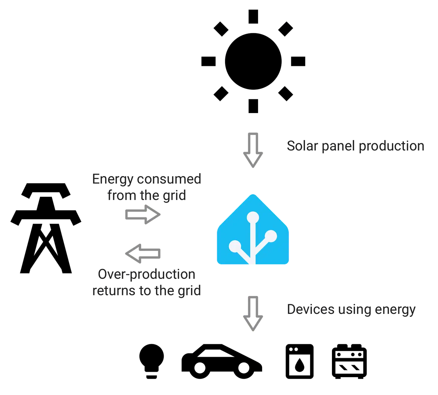
Grid sensors need two entities: one for import (power you buy) and one for export (power you sell back). Most smart meters and CT clamps expose these as separate sensors. If your meter only reports net flow, you’ll need a template sensor to split positive values (import) from negative values (export).
Solar output needs one running kWh counter from your inverter showing total energy made. Nearly every solar inverter add-on ships this by default.
Battery sensors need two running counters: energy charged in (kWh) and energy sent out (kWh). Battery state of charge (SOC, 0-100%) is handy for live views on your main dashboard. The Energy Dashboard itself doesn’t need it.
You can also track single devices. Add energy sensors from smart plugs like the Shelly Plug S , or Zigbee plugs with energy reads, to see which devices use the most. The dashboard has its own “Individual Devices” section that breaks this down as a pie chart.
Connecting Solar Inverters to Home Assistant
Your inverter is the main data source for output tracking. The path you pick depends on your brand. The gap between cloud-based and local links is bigger than you might think.
Enphase Envoy
The native Enphase Envoy add-on finds the Envoy gateway on your local network. It gives you per-panel output, total output, grid use (if CT clamps are fitted on your Envoy), and battery data for IQ Battery systems. It polls the Envoy’s local REST API every 60 seconds by default. For firmware 7.x and later, you’ll need your Enphase account login during setup. Home Assistant uses it to fetch the auth token for local API access. The token lasts one year and auto-renews one month before it expires.
SolarEdge
SolarEdge
offers two paths. The cloud-based SolarEdge add-on uses your API key from the SolarEdge portal. It gives you inverter output, lifetime energy, and power flow data. The downside: it leans on the cloud, with a 15-minute update lag and a cap of 300 API calls per day.
For most users, the better pick is the SolarEdge Modbus Multi custom add-on (via HACS). It links to your inverter locally over Modbus TCP. Updates can be as fast as one per second, with zero cloud needed. To turn it on, switch on Modbus TCP via the inverter’s installer menu (SetApp or LCD panel), then point the add-on at the inverter’s local IP on port 1502. One catch: SolarEdge inverters only allow one Modbus TCP link at a time, so you may need to switch off SolarEdge’s own monitoring link.
Fronius
The Fronius add-on links to the Fronius Datamanager locally via its HTTP API. It gives you PV output, grid in and out, and battery data for Fronius/BYD hybrid rigs. Update rates are fast, under a second in some rigs.
SMA
The SMA Solar add-on talks via SMA’s Speedwire on your local network. It covers inverter output, grid meter reads (if an SMA Energy Meter or Home Manager 2 is fitted), and battery data for SMA Storage gear.
Generic Option for Other Inverters
If your inverter brand lacks a native add-on, a Shelly EM with a CT clamp on the solar breaker can measure output on its own. The Shelly EM Gen3 runs around $45, links over local Wi-Fi with no cloud needed, and its native Home Assistant add-on exposes power, voltage, current, and running energy sensors right out of the box. For the price, it’s hard to beat as a brand-free solar monitor. For a wider look at per-circuit energy tracking with CT clamps across your whole home, see tracking your home’s energy usage with Home Assistant .
Integrating Battery Storage Systems
Battery systems make energy flow tracking harder. But they’re the key to seeing self-use and grid freedom.
Tesla Powerwall
The Tesla Powerwall add-on links to the Powerwall Gateway (TEG) on your LAN via polling. It gives you battery SOC, charge/discharge power, grid in and out, solar output, and home use. One add-on covers nearly every sensor the Energy Dashboard needs. Note that the local API is read-only. Tesla pulled control from the local gateway, so if you want to switch modes or backup reserve levels, you’ll need a cloud tool like Teslemetry as a bridge to Tesla’s Fleet API.
Enphase IQ Battery
If you have Enphase batteries, the data comes through the same Enphase Envoy add-on used for solar. The Envoy reports battery SOC, charge/discharge energy, and the rig’s mode (self-use, backup, time-of-use). No extra add-on needed.
SonnenBatterie
The SonnenBatterie custom add-on (via HACS) links to the battery’s local API (port 80 on the Sonnen unit). It gives you SOC, charge/discharge power, output, use, and grid flow, all from one box.
DIY and Hybrid Systems
For off-grid or hybrid inverter/chargers like EG4, Sol-Ark, or Victron, you mostly link via Modbus TCP/RTU to read registers right from the inverter. Victron
gear can use the Victron add-on, or venus-mqtt for data via MQTT from a Cerbo GX box.
Converting Power to Energy
If your battery add-on only gives you live power (Watts) rather than running energy (kWh), you need the Riemann Sum Integral helper. Go to Settings > Devices & Services > Helpers, make a new Integration (Riemann Sum) helper, pick the power sensor as the source, and choose the trapezoidal method. It’s the most accurate method when the source sensor updates often. The helper makes a new kWh sensor you can plug into the Energy Dashboard.
A handy extra outside the Energy Dashboard: drop a gauge card on your main dashboard showing battery SOC with color zones, green (60-100%), yellow (20-60%), red (0-20%), for quick at-a-glance storage state. You can even pair it with logic that swaps the tile based on charge level so a low-battery warning takes over the slot.
Configuring the Dashboard Step by Step
With all your sensors hooked up and reporting, here’s how to wire them into the Energy Dashboard.
Start by going to Settings > Dashboards > Energy, or open the Energy panel from the sidebar and click “Configure.”
For grid use, pick your grid import sensor (must be kWh with total_increasing state class). If your utility charges different rates by time of day, you can add a cost entity. Either a template sensor returning your current rate in $/kWh, or use the built-in “Use a static price” option for flat-rate plans.
Grid return is next: pick your grid export sensor and set your feed-in tariff rate. This lets the dashboard tally revenue from exported solar energy, whether you’re on net metering or a feed-in tariff plan.
Under solar panels, pick your output sensor. If you run more than one inverter or separate strings, add each one on its own. The dashboard sums them for you. You can assign a cost entity for the value of solar output at your avoided grid rate.
For the home battery section, add the charge sensor and discharge sensor as separate entities. The dashboard works out net battery flow and shows charge/discharge spans on the daily graph.
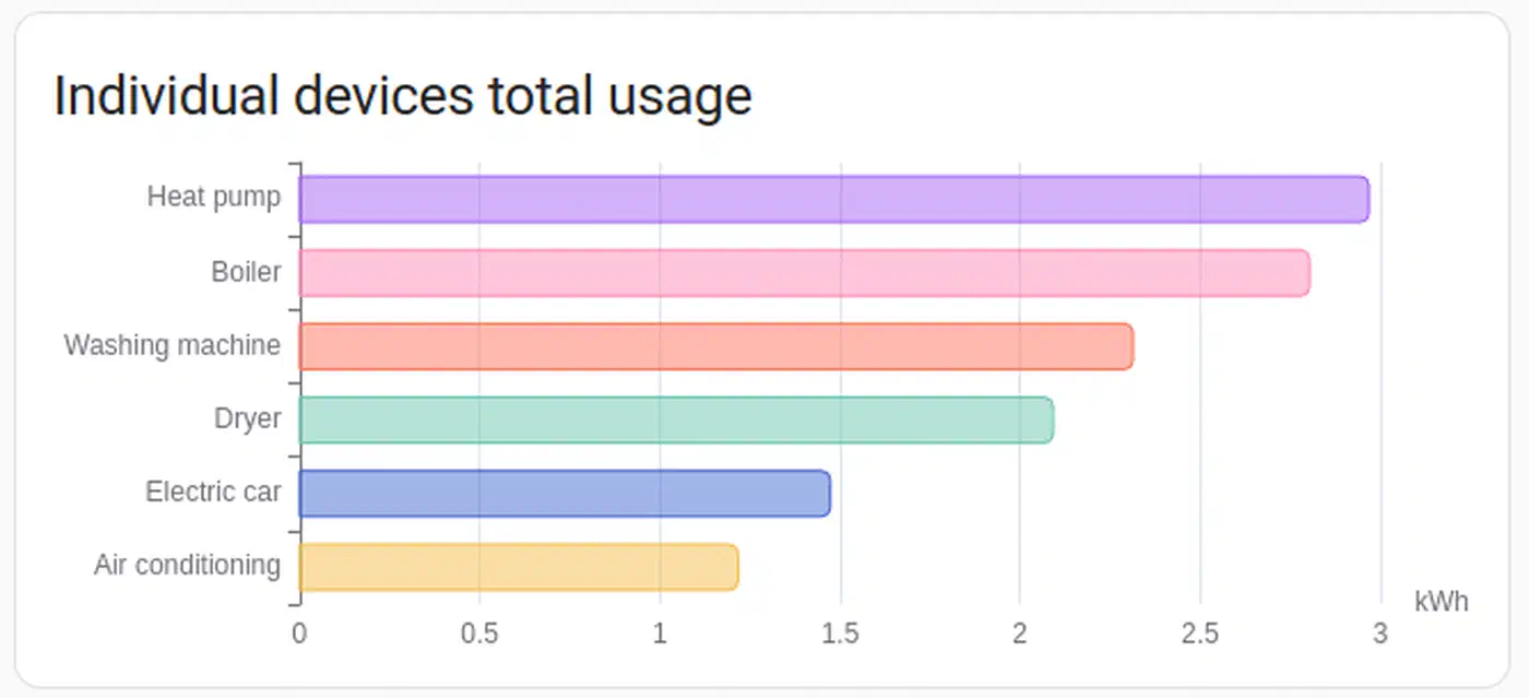
Single devices are optional but worth adding for your big loads, HVAC, EV charger, dryer, water heater. The dashboard draws each device’s share of total use as a pie chart, which is handy for spotting the gear that quietly burns the most energy.
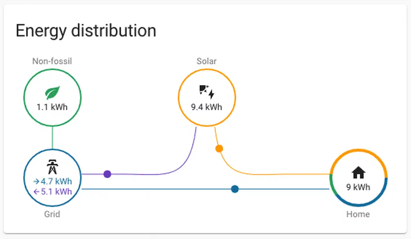
After saving, give it 1-2 hours for data to build up. Check that the “Energy Distribution” flow diagram shows arrows pointing the right way: solar flows to home and battery, battery flows to home and grid, grid flows to home. If arrows are reversed or missing, you likely have a sensor in the wrong slot, or one that’s reporting negative values.
Advanced Analysis With Custom Sensors
The Energy Dashboard shows the basics well. Custom template sensors and utility meters push the view further.
Self-Consumption Ratio
This tells you what share of your solar energy you use yourself rather than send to the grid. Higher is better for getting the most from your setup. Build a template sensor:
template:
  - sensor:
      - name: "Solar Self-Consumption Ratio"
        unit_of_measurement: "%"
        state: >
          {% set production = states('sensor.solar_production_daily') | float(0) %}
          {% set export = states('sensor.grid_export_daily') | float(0) %}
          {% if production > 0 %}
            {{ ((production - export) / production * 100) | round(1) }}
          {% else %}
            0
          {% endif %}
Grid Independence Ratio
Shows what share of your total energy use comes from solar and battery rather than the grid:
template:
  - sensor:
      - name: "Grid Independence"
        unit_of_measurement: "%"
        state: >
          {% set consumption = states('sensor.home_consumption_daily') | float(0) %}
          {% set grid_import = states('sensor.grid_import_daily') | float(0) %}
          {% if consumption > 0 %}
            {{ ((consumption - grid_import) / consumption * 100) | round(1) }}
          {% else %}
            0
          {% endif %}
Monthly ROI Tracking
Use Utility Meter
helpers with a monthly cycle to track solar output and grid export over billing months. Set them up under Settings > Devices & Services > Helpers by picking “Utility Meter,” pointing it at your solar output or grid export sensor, and setting the cycle to monthly. Multiply monthly output by your avoided power rate, and the monthly export by your feed-in tariff, to work out savings. Track running savings against your system’s total cost to see your payback line.
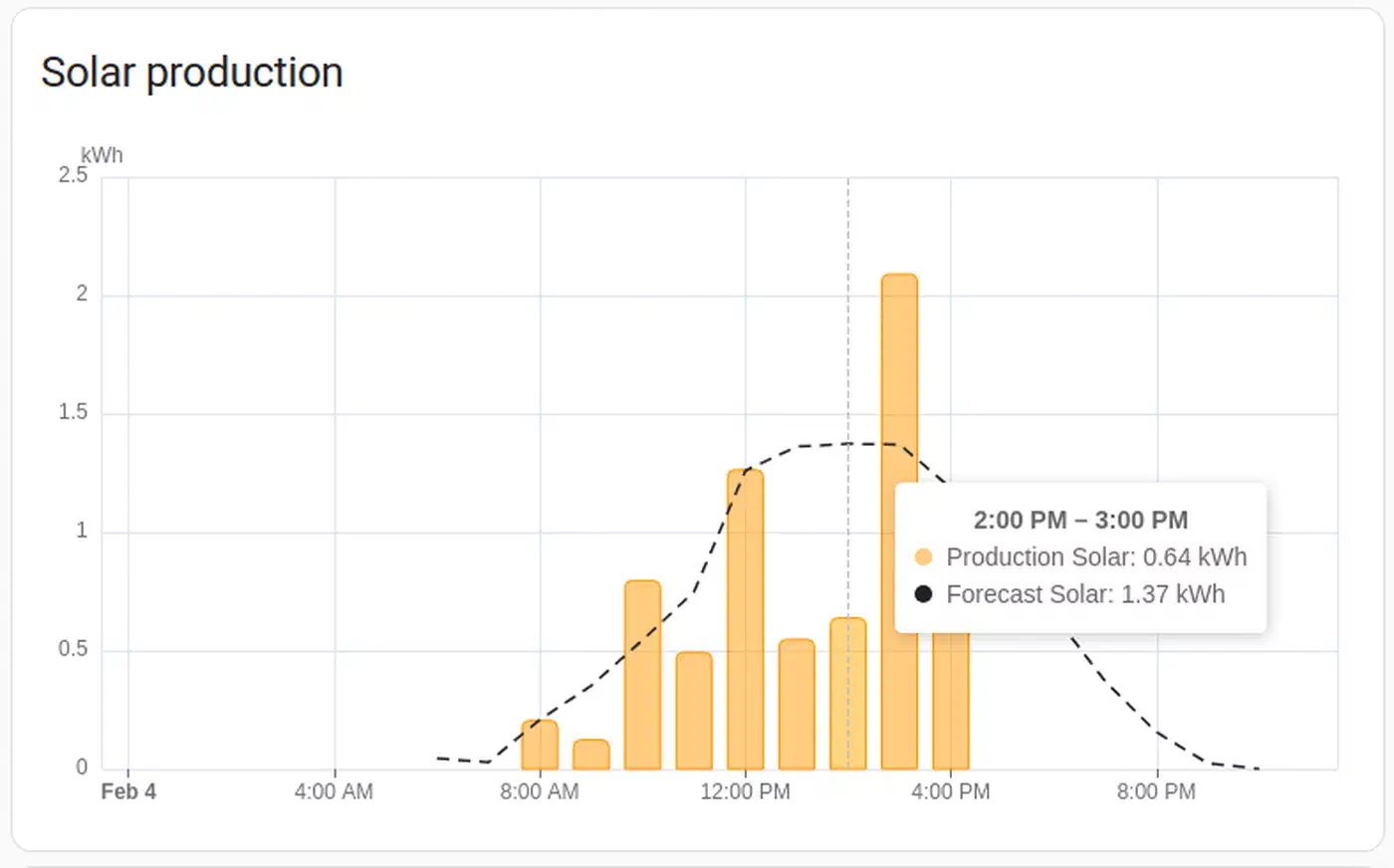
Peak Production Monitoring
Use statistics template sensors with stat_type: max to log daily peak solar output and peak home use. Stacking peak output against your system’s rated size tells you whether your panels hit their target, or if shading, soiling, or wear is eating into output.
Time-of-Use Battery Optimization
If your utility charges different rates for peak and off-peak hours, you can automate battery behavior. Build flows that charge the battery from the grid during off-peak hours, then drain it during peak, with your battery add-on’s mode control. This works well with the Tesla Powerwall (via Teslemetry) and Enphase IQ rigs that expose mode switches. For logic that goes past HA’s native automation editor, AppDaemon lets you write time-of-use charging plans as Python classes, with full access to battery state history.
Excess Solar Alerts
Set up a notice that fires when solar output beats home use by more than 2 kW and the battery is full (SOC above 95%). That’s the ideal moment to start big-load tasks: run the dishwasher, throw in a load of laundry, or plug in the EV. An automated lawn watering schedule is another deferrable load worth shifting into a surplus window. You’re making power that would otherwise go out at a lower feed-in rate.
Troubleshooting Common Issues
A few problems come up repeatedly when setting up the Energy Dashboard.
“Statistics not available” errors: This mostly means the sensor lacks the right device_class or state_class tags. Check under Developer Tools > States that your sensor has device_class: energy, state_class: total_increasing, and a unit of kWh. If you made a Riemann Sum helper and it shows the wrong device class, you may need to fix it by hand with a customize entry
in your configuration.yaml.
Negative energy values: This happens when a sensor that should be total_increasing resets or drops. Common causes: inverters that reset their daily counter at midnight, or sensors that briefly report 0 during link errors. The Energy Dashboard expects values that only rise. Any drop gets read as a meter reset. If your sensor resets daily, think about using a Utility Meter helper to build a real running counter.
Wrong statistics: If bad data has been logged, go to Developer Tools > Statistics to find and remove the broken reads. It’s the only way to fix past data that’s skewing your graphs.
Missing data gaps: If the dashboard shows gaps, your sensor likely went down. Check your add-on’s poll rate and your device’s network health. For Wi-Fi devices like Shelly, a stable link counts. Interference or weak signal can cause dropouts that show up as missing bars in the energy graphs.
Carbon Tracking and Beyond
The Electricity Maps add-on (formerly CO2Signal) adds carbon data to your Energy Dashboard. It queries the Electricity Maps API for your region’s current grid carbon level in gCO2eq/kWh, and shows what share of your local grid relies on fossil fuels. The Energy Dashboard uses this on its own to work out your home’s carbon footprint based on real grid import. The free tier supports one zone with up to 50 API requests per hour.
For users who want more than Home Assistant’s built-in charts, send energy data to InfluxDB and plot it with Grafana . That opens up time-series views with any query you want, custom roll-up windows, and dashboards that can lay weather data, power prices, and output forecasts on the same timeline.
Once it’s all set up and data starts flowing, the Energy Dashboard swaps guesswork for hard numbers. You can see how much solar you made, how much you stored, how much you pulled from the grid, and what it all cost, on any given day, week, or month. That kind of view changes how you think about running your home.