 Botmonster Tech
EpicInfographics skill for Claude dodges the AI look


The EpicInfographics skill for Claude Code makes your agent draw data inside a scene instead of a grid of rounded cards. It ships nine scene-native design languages, blocks the render when text collides, and exports a matching MP4 or GIF from the same HTML file. The gallery holds thirteen finished pieces.
Key Takeaways
- EpicInfographics builds each graphic as a scene with depth and lighting.
- Nine design languages ship with exact hex codes, fonts, and geometry.
- A preflight script stops the render when text collides or clips.
- One HTML file makes the still PNG and the animated MP4 and GIF.
- The launch thread hit 142 upvotes on r/ClaudeCode in a day.
What is the EpicInfographics skill?
EpicInfographics is an agent skill , a bundle of markdown specs plus three Node scripts that a coding agent reads and then runs. You get back an HTML and CSS file. Headless Chromium renders it to PNG at 2x, and the same file can also produce an MP4 and a GIF. Skills that hand back a real deliverable are a small but growing group; a CAD skill for Claude turns one line of text into a machinable STEP file the same way.
Ask an AI for an infographic and you get rounded cards in a neat grid, as the project README puts it. You get Tailwind blue, an emoji where an icon should be, and a bar chart on a flat background. It works, and anyone can tell a machine made it. The same complaint drives Hallmark’s anti-slop rules for web page design.
Installing it into Claude Code takes two lines.
/plugin marketplace add OrRon/EpicInfographics
/plugin install epic-infographics@epic-infographics
Codex, Factory Droid and Pi each get their own plugin manifest. For anything else, clone the repo and copy the skill folder in by hand. Rendering needs a real browser engine.
npm install && npx playwright install chromiumSkip it and the agent runs the same thing itself on your first render. After that you talk to it in plain language. Ask for an infographic about your Q3 numbers, dark and dramatic, 16:9. It first pins down who the graphic is for and whether it should move. Then it pitches you two or three story angles.
Three graphics the skill drew on its own
I did not touch any of these up. Someone typed one line, and the skill made the whole thing.
The signup funnel uses the dark-glass language on a square canvas. The funnel is made of stage light, drawn at one pixel per 140 users. You read the proportion off the shape, with no number pasted on top.
The orbital launch piece is a cyanotype drafting sheet in the blueprint language. It has dimension arrows and a stamped title block. The rocket’s hatched section is exactly the 90% propellant fraction. The animation drafts the whole sheet line by line.
Two tiny worlds of work sets remote and office life side by side. Each is a small floating world on an exact 2:1 isometric grid. The data is built as architecture, so taller means more and the buildings are the chart.
The whole set runs to thirteen briefs, twelve design languages and six canvas formats. Every piece is animated. The prompts are published in examples/briefs.md , so you can run the same brief and compare.
The scene is already on stage when the animation starts, the data arrives in order, and the hero lands last. A bundled script scrubs the page’s CSS keyframes one frame at a time and hands them to ffmpeg. Every render comes out the same, and the last frame is the approved still.
The design languages, and the three it avoids
Each style file is a full spec the agent runs as written. It carries exact hex codes, font pairings, geometry, signature devices, and a do’s and don’ts list. These files are where most of the work lives, and everything else is plumbing.
| Design language | The look | Suits |
|---|---|---|
| blueprint | Cyanotype drafting sheet, dimension arrows, hatch fills | Machines, structures, anything with parts |
| dark-glass | Luminous data on deep space, glass panels, controlled glow | Market share, funnels, dramatic numbers |
| naturalist-plate | Field-guide engraving, watercolor tints, foxing | Plants, animals, anatomy, life cycles |
| isometric-world | Miniature dioramas on an exact 2:1 projection | Comparisons of two places or two ways of working |
| retro-print | Four inks, misregistration, film grain, arc text | Posters, campaigns, anything printed |
| editorial | Magazine feature, huge type, drop caps, charticles | Long explainers and story formats |
| hand-drawn | Marker sketchbook, wobbly lines, washi tape | Friendly explainers and social graphics |
| park-poster | WPA screen-print vista with a tiny figure for scale | Places, travel, scale comparisons |
| cutaway | Sliced cross-section, numbered callouts, detail lenses | How a thing works on the inside |
Three more styles sit in quarantine. Swiss, corporate-clean and neo-brutalist are tagged high slop-risk, because they are flat by design. The skill reaches for them only when you ask by name, and even then it pushes scene-craft into them.
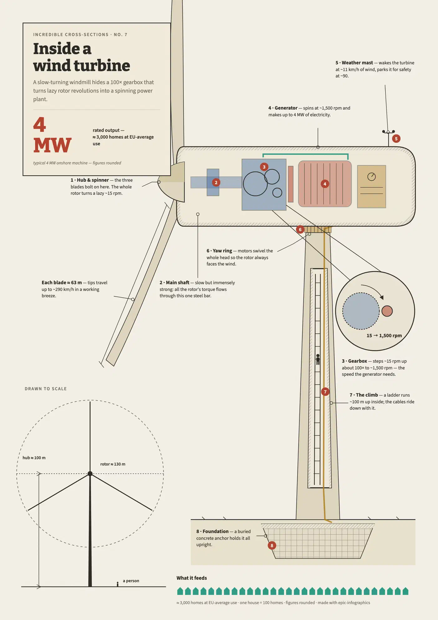
All of it comes back to where the reader is standing. If the answer is “looking at a well-designed page”, the agent starts over. Flat minimalism counts as a failure here, even when it’s tidy.
How does it stop the chart from lying?
Geometry is truthful by rule. Bars start at zero and area scales with value. Dual axes and guessed proportions are banned outright. Bar ratios, donut arcs and areas come from math written into the file, so the shape and the number can’t drift apart.
Color gets a machine check too. Every palette, light and dark, passes six tests before it ships. They cover lightness, chroma, contrast and color-blind separation. Nothing gets to be pretty and unreadable at once.
The layout gate is the one I find most unusual. A preflight script loads the finished page and measures where every letter lands. It refuses to go on while text collides, gets clipped, leaves the canvas, or drops below readable size. Most design prompts leave overlapping text to the model’s own eye, while this one measures the page and stops when the numbers say so.
Then the agent grades its own work. It screenshots the PNG, reads it back, and scores it against a hard anti-slop list. That list holds a no-text squint test, a template test and a flat-ground test. “Could be a dashboard template” is a hard fail. For video, it reviews an eight-frame contact sheet of its own MP4 first.
What Reddit made of it
The project went up on r/ClaudeCode and drew 142 points and 19 comments inside a day. That is a warm welcome for a subreddit that mostly runs on bug reports.
I didn’t like CluadeCode’s infographics capabilities, so I built a skill that can do that
One commenter said it was exactly what they needed for schematics and lesson material. Another called it a breath of fresh air next to the usual run of skill complaints.
The author clearly cares about output that doesn’t read as machine-made, so one reader told him to do the same for his writing , since the README was “very opus coded”. The author took the tip.
That exchange opened the thread’s only real argument. One reader doubted any de-slopping writing skill works yet, calling it unsolved even for their own docs. The reply was a homegrown skill wrapping the Vale linter plus personal voice rules. It works, but it burns tokens every run.
Two asks went unanswered. One reader, building the same thing for UI work at his company, wanted to know if it ports to Codex. He also asked what worked best to de-slop the design. The repo has since shipped a Codex manifest, which settles the first one. The upvotes landed on the post, and every reply sits in single digits.
What it needs and what it won’t do
It needs a real browser engine. Playwright and headless Chromium do the rendering, and ffmpeg does the video. Without that toolchain there is no render path. The HTML sources open in any browser, but that is where the portability stops.
It also costs tokens. One or two self-correction loops usually run out of your sight, plus the render-review pass on top. A quick chart for a slide deck is cheaper as a plain SVG.
Made-up figures are off the table too. You supply the data, or the agent researches it, and sample values get labeled as such in the footer.
And it is brand new. The rules are written in markdown files, and those files can change from one update to the next.