 Botmonster Tech
CSS @scope retires BEM, CSS Modules, and CSS-in-JS

The CSS @scope at-rule pins selectors to one branch of the DOM. Write @scope (.card) { img { border-radius: 12px; } } and only the img tags inside .card change. An optional to clause sets a lower edge, so the scope stops at nested components. Add proximity in the cascade and @scope covers what BEM, CSS Modules, CSS-in-JS, and Shadow DOM were built for, natively, with no build step and no runtime cost.
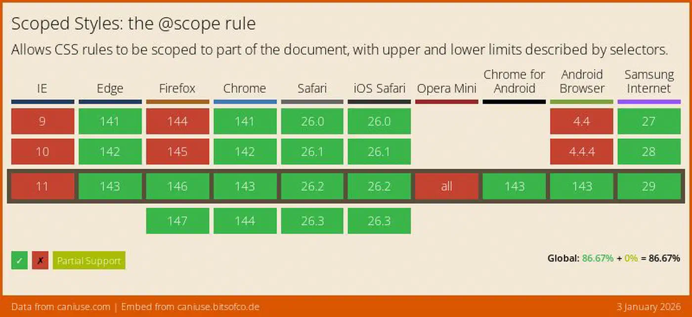
@scope shipped in Chrome 118 (October 2023), Safari 17.4 (March 2024), and Firefox 146 (December 2025). It hit Baseline status across all three engines at the end of 2025. Can I Use reports 91% global support. In 2026 it’s safe to ship without fallbacks for mainstream audiences.
Why component style scoping was broken for fifteen years
CSS selectors are global by default. A .title rule in your card fights a .title rule in your sidebar. The cascade picks a winner based on specificity and source order. Neither has anything to do with which component you meant to style. Every fix the industry adopted over the past decade worked around this single flaw.
BEM, or Block Element Modifier, asks you to bake the component structure into class names: .card__title--large, .card__header, .card__footer--sticky. It works. But every class carries its prefix, the HTML swells with long attribute values, and one person who forgets the rule breaks the whole thing.
CSS Modules fix it at build time, rewriting .title into .title_a1b2c3. Nothing can clash. In exchange you need a bundler like webpack or Vite, your styles hang off JS imports, and DevTools shows you hash strings instead of the names you wrote.
CSS-in-JS libraries like styled-components and Emotion moved scoping into the runtime. They feel good to write and they take dynamic values. They also add bundle size, muddy server-side rendering, and inject styles while React renders, which costs real speed. Zero-runtime options like vanilla-extract cut that cost but still want build tooling.
Shadow DOM gives you true isolation: outer CSS can’t reach in, inner CSS can’t reach out. That’s exactly right for third-party widgets embedded on arbitrary pages. It’s overkill for your own component tree. You lose cascade inheritance. Global theme tokens need ::part or CSS custom properties to cross the boundary. Form elements behave oddly inside shadow roots.
@scope fills the gap between those extremes. It keeps the full cascade intact while limiting where selectors match. It works without a naming convention, a bundler, or a runtime.
Basic syntax, the to clause, and the :scope selector
The block form is the one you will use most often:
@scope (.card) {
  h2 { color: rebeccapurple; }
  a { text-decoration: none; }
}
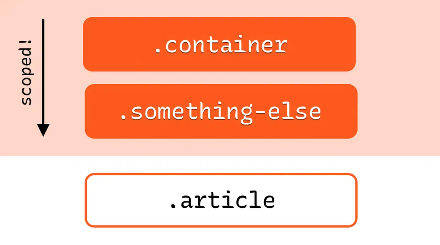
Every selector inside the block is scoped to descendants of .card. An h2 in a sidebar, a footer, or anywhere else on the page is left alone.
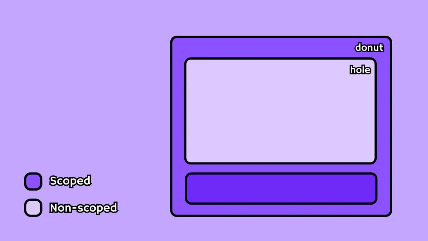
The donut scope
The to clause adds a lower boundary:
@scope (.card) to (.card-footer) {
  p { font-size: 0.9rem; }
}
Styles run from .card down but stop at .card-footer and its children. Say your card holds a comment widget with its own paragraph styles. The donut scope keeps your card type from leaking in. That is what puts @scope ahead of a plain descendant selector.
Styling the root itself
The :scope pseudo-class targets the scope root element:
@scope (.card) {
  :scope { padding: 1rem; border: 1px solid #ddd; }
  h2 { font-size: 1.25rem; }
}
:scope has a specificity of (0,1,0), the same as a single class selector. Bare selectors inside the block, like h2 above, keep their normal specificity. They don’t pick up the scope root’s weight.
Inline scoping with <style>
When you omit the scope root, @scope defaults to the parent element of the <style> tag:
<article class="card">
  <style>
    @scope {
      :scope { padding: 1rem; }
      p { margin: 0; }
    }
  </style>
  <p>This paragraph gets margin: 0.</p>
</article>
This form is handy for server-rendered HTML fragments, HTMX responses, or any template workflow where you want local styles without a build step.
Multiple roots and selector lists
Both sides of the @scope declaration accept selector lists:
@scope (.card, .media-object) to (.footer, nav) {
  img { border-radius: 8px; }
}
Comparison table: @scope vs. the alternatives
| Feature | BEM | CSS Modules | CSS-in-JS | Shadow DOM | @scope |
|---|---|---|---|---|---|
| Build step required | No | Yes | Yes (or runtime) | No | No |
| Runtime cost | None | None | Yes (runtime libs) | None | None |
| Cascade inheritance preserved | Yes | Yes | Yes | No | Yes |
| Lower boundary (donut) | No | No | No | Yes | Yes |
| Proximity-based cascade | No | No | No | No | Yes |
| DevTools class name readability | Verbose | Hashed | Generated | N/A | Clean |
| Framework dependency | None | Bundler | React/framework | Browser | Browser |
| True style encapsulation | No | No | No | Yes | No |
Shadow DOM is still the right call when you need real isolation: third-party embeds, custom elements shared across unrelated apps, and browser extension UIs. BEM still works if you want zero deps and your team holds the line. CSS Modules earn their keep in monorepos that already use them for type-safe class imports. Tailwind sits outside all of this, since utility classes never needed scoping. They carry no semantic name to clash.
For everything else, reach for @scope. It suits server-rendered apps in Hugo, Astro, Rails, Phoenix, or Django, and any project that wants clean component CSS without build tooling.
Real example: migrating a card component from BEM to @scope
Here is a typical card written with BEM conventions:
<article class="card card--featured">
  <header class="card__header">
    <h2 class="card__title">Post Title</h2>
    <span class="card__meta">April 2026</span>
  </header>
  <div class="card__body">
    <p class="card__excerpt">A short summary of the post content.</p>
  </div>
  <footer class="card__footer">
    <a class="card__link card__link--primary" href="#">Read more</a>
  </footer>
</article>
The BEM stylesheet needs ten or more selectors, each one prefixed with .card__:
.card { display: grid; gap: 1rem; }
.card--featured { border: 2px solid gold; }
.card__header { display: flex; justify-content: space-between; }
.card__title { font-size: 1.5rem; }
.card__meta { color: gray; }
.card__excerpt { line-height: 1.6; }
.card__footer { padding-top: 0.5rem; }
.card__link--primary { background: blue; color: white; padding: 0.5rem 1rem; }
Here is the same component rewritten with @scope:
<article class="card featured">
  <header>
    <h2>Post Title</h2>
    <span class="meta">April 2026</span>
  </header>
  <div class="body">
    <p class="excerpt">A short summary of the post content.</p>
  </div>
  <footer>
    <a class="primary" href="#">Read more</a>
  </footer>
</article>@scope (.card) {
:scope { display: grid; gap: 1rem; }
:scope.featured { border: 2px solid gold; }
header { display: flex; justify-content: space-between; }
h2 { font-size: 1.5rem; }
.meta { color: gray; }
.excerpt { line-height: 1.6; }
footer { padding-top: 0.5rem; }
footer a.primary { background: blue; color: white; padding: 0.5rem 1rem; }
}The HTML goes from 8 class attributes to 4, and the CSS trades repeated .card__ prefixes for short, clear selectors. Renaming the component from .card to .post-card means changing exactly one selector instead of running find-and-replace across two files.
To stop card styles from bleeding into a nested comment thread, add a lower boundary:
@scope (.card) to (.comments) {
  h2 { font-size: 1.5rem; }
  p { line-height: 1.6; }
}
Both Chrome DevTools and Firefox DevTools show scoped rules with an @scope marker in the Styles panel. You can inspect which scope root matched a given element.
Specificity, the proximity cascade, and common gotchas
Three rules will spare you most surprises with @scope.
Rule 1: the scope root does not add specificity
@scope (.card) { h2 { color: red; } } has a specificity of (0,0,1). That’s the same as a bare h2 { color: red; }. The scope root .card is not part of the selector. It only controls where the selector matches. This is by design: scoping should not start a new specificity arms race.
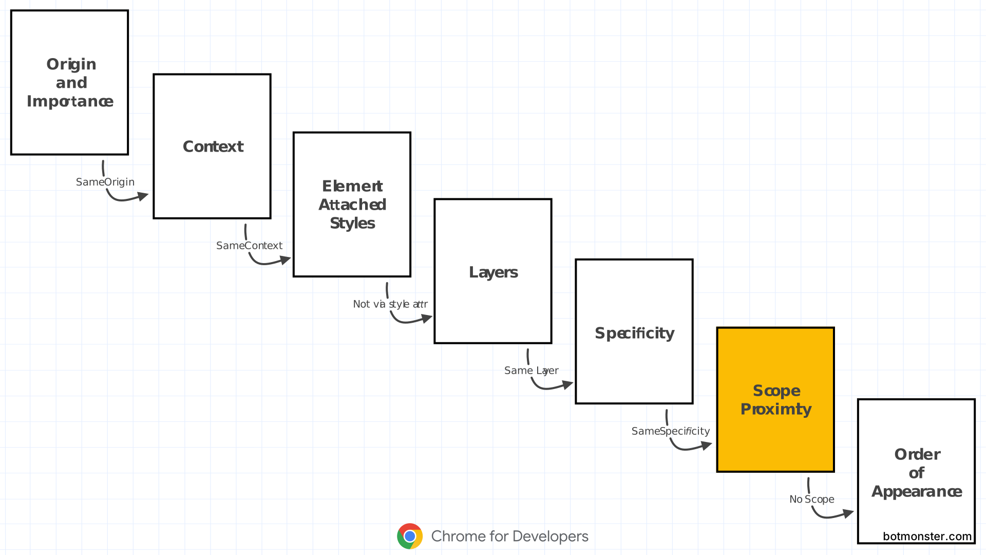
Rule 2: proximity wins ties between scoped rules
Two scoped rules can hit the same element with the same specificity and the same layer. The winner is the one whose scope root sits closer up the DOM tree. Take nested theme containers:
@scope (.light-theme) {
  p { color: black; }
}

@scope (.dark-theme) {
  p { color: white; }
}<div class="light-theme">
<div class="dark-theme">
<div class="light-theme">
<p>This text is black.</p>
</div>
</div>
</div>The innermost <p> is one hop from .light-theme but two hops from .dark-theme, so it gets color: black. This proximity rule is what makes nested theming work right without !important or fake specificity bumps.
Rule 3: scoping does not beat source order against unscoped rules
An unscoped h2 { color: blue; } that appears later in the stylesheet beats a scoped @scope (.card) { h2 { color: red; } } of equal specificity. Proximity only breaks ties between two scoped rules. If you need your scoped styles to win every time, use cascade layers:
@layer base, components;

@layer base {
  h2 { color: blue; }
}

@layer components {
  @scope (.card) {
    h2 { color: red; } /* wins because 'components' layer comes after 'base' */
  }
}
@scope and @layer stack well. Put scoped styles in a components layer and your resets and globals in a base layer. Cascade order is then explicit, whatever the source order. If a component also has to react to its container’s size instead of the viewport, pair @scope with a way to size components to their container for a fully native model.
Common gotchas
The biggest gotcha is that @scope (.card) { .title { ... } } matches .title anywhere inside .card, not just direct children. Use :scope > .title when you want only direct children to match.
Another common surprise: @scope scopes selector matching, not property inheritance. A color set on the scope root still flows into elements past the lower boundary. If you need full isolation, Shadow DOM is the right tool.
There are also two hard limits. Pseudo-elements like ::before and ::after are not valid as scope roots or scope limits. And selectors can’t escape the subtree. Writing :scope + p inside an @scope block is invalid because sibling selectors point outside the scope root.
Adopting @scope in 2026: a practical migration strategy
At 91% global support and Baseline since December 2025, shipping @scope is low risk. Browsers without it read @scope blocks as unknown at-rules and skip them. Your styles simply don’t apply, which is a safe way to fail. The same native-first move shows up in layout work, where you can drop Floating UI for tooltips and dropdowns outright.
Feature detection
@supports (selector(:scope)) {
  /* @scope is available */
}
Or in JavaScript:
CSS.supports('selector(:scope)')Progressive enhancement pattern
Write a brief unscoped fallback for critical styles, then override with @scope:
/* Fallback for older browsers */
.card h2 { font-size: 1.25rem; }

/* Modern browsers get the scoped version */
@scope (.card) {
  h2 { font-size: 1.25rem; line-height: 1.3; }
}
Migration path from BEM
Start with new components. Write them with @scope, short class names, and no prefixes. Leave existing BEM components alone until you touch them for other reasons. This avoids a risky big-bang rewrite and lets the team get used to the syntax over time.
Migration path from CSS Modules
CSS Modules give you one thing @scope does not: a JavaScript import graph that hands TypeScript type-safe class names. If your team leans on that, keep CSS Modules for the imports and use @scope inside the module files for nested boundaries. The two sit side by side without trouble. Layout has its own native answer now as well, since subgrid lines up nested cards that used to need fixed heights.
Tooling support
Editor and linter support is already solid. VS Code has autocompleted @scope through the built-in CSS language service since 2024. Stylelint picks it up in stylelint-config-standard v36 and later. Prettier has formatted @scope blocks correctly since v3.1. On the build side, @csstools ships PostCSS plugins that polyfill some of the behavior, though in 2026 the polyfill is rarely worth the hassle. Those linters check syntax. A newer kind of scanner reads the finished page instead and flags the tells of machine-made design, such as overused fonts or cards nested inside cards.
How @scope compares to framework scoped styles
Vue’s <style scoped>, Svelte’s component-scoped styles, and Astro’s scoped styles all came before native @scope. They run at compile time, rewriting selectors to carry generated data attributes or hashed classes. Native @scope works another way. The browser checks the boundary while it matches selectors, so there is no build artifact and no attribute clutter in the DOM. The two can coexist. Astro, SvelteKit, Nuxt, and Next.js all pass @scope straight through, because it is standard CSS.
When not to use @scope
@scope is not a universal swap. Anything that has to survive whatever the host page throws at it still wants Shadow DOM, including third-party widgets, Web Components shipped as standalone packages, and browser extension UIs. Tailwind’s utility-first approach solves a different problem, fast prototyping against a design system, and it does not clash with @scope. CSS Modules stay useful in TypeScript-heavy projects where the import graph type-checks class names.
But for the common case, your own components in your own app, rendered by a server or a static site generator, @scope does what BEM, CSS Modules, and CSS-in-JS always tried to do. The browser handles it with zero setup.