 Botmonster Tech
View Transitions API: smooth page animations without a JavaScript framework

The Short Answer
The View Transitions API is a native browser feature that animates the change between two DOM states using CSS. The browser snapshots the page before and after a DOM update, cross-fades between them, and lets you customise the animation with a few lines of CSS. You do not need React, GSAP, or Framer Motion to get smooth transitions anymore. As of Firefox 144 (released October 14, 2025), same-document transitions are Baseline Newly Available , and cross-document transitions work in Chrome 126+, Edge 126+, and Safari 18.2+.
What the View Transitions API Solves
Web navigation has always had a visual problem. Click a link on a multi-page site and you get a flash of white, a layout jump, and a sudden content swap. Update the DOM in a single-page app and the old content vanishes instantly, replaced by whatever the framework rendered. Native apps have spoiled users with shared-element transitions, card morphs, and smooth page slides for more than a decade, yet the web has been stuck with jarring jumps or heavy JavaScript workarounds.
The old options were all painful. React Transition Group ties you to React and its lifecycle quirks. Framer Motion works beautifully but adds around 50KB gzipped and only runs inside React. GSAP is powerful but licensed and requires you to hand-roll the capture-and-restore logic yourself. Barba.js pioneered page transitions on MPAs but relies on intercepting clicks and XHR-loading the next page. Every approach adds bundle weight, couples animation to framework internals, and breaks the moment someone hits the back button with JavaScript disabled.
The View Transitions API moves the animation work from your JavaScript into the browser itself. The browser takes a screenshot of the current state, runs your DOM update, takes a screenshot of the new state, and cross-fades between them on the compositor thread. You write CSS to customise the cross-fade, and the JavaScript side is usually a single function call. Everything else is a pseudo-element tree you can target with @keyframes.
The API comes in two flavours. Same-document transitions animate a DOM update within a single HTML document, which covers SPAs and any in-place content change. Cross-document transitions animate the full navigation between two separate HTML pages, which covers classic MPAs and static sites. Both share the same CSS surface, so once you learn the pseudo-elements, the knowledge transfers between them.
Browser support has finally caught up. Same-document transitions shipped in Chrome 111 back in 2023, Safari 18 in late 2024, and Firefox 144 on October 14, 2025, which is the moment the feature crossed the Baseline Newly Available line. Cross-document transitions landed in Chrome 126 (June 2024) and Safari 18.2 (December 2024); Firefox has not shipped them yet but is tracking the work. Critically, browsers that do not support the API simply skip the animation and the page still works, so you can ship it today as pure progressive enhancement.
| Feature | Chrome / Edge | Safari | Firefox |
|---|---|---|---|
Same-document (startViewTransition) | 111+ | 18+ | 144+ |
Cross-document (@view-transition) | 126+ | 18.2+ | Not yet |
view-transition-class | 125+ | 18.2+ | 144+ |
view-transition-name: match-element | 137+ | 18.2+ | 144+ |
| Nested transition groups | 140+ | 18.2+ | Not yet |
Same-Document Transitions: The SPA Pattern
The core API is a single method on document:
document.startViewTransition(() => {
  // Any synchronous DOM update goes here.
  renderNewContent();
});
Everything inside that callback runs between the “before” and “after” snapshots. The browser captures the current state first, runs the callback, captures the new state, and then animates between them. The default animation is a 250ms cross-fade on the root, which already looks better than an instant swap for almost any content change.
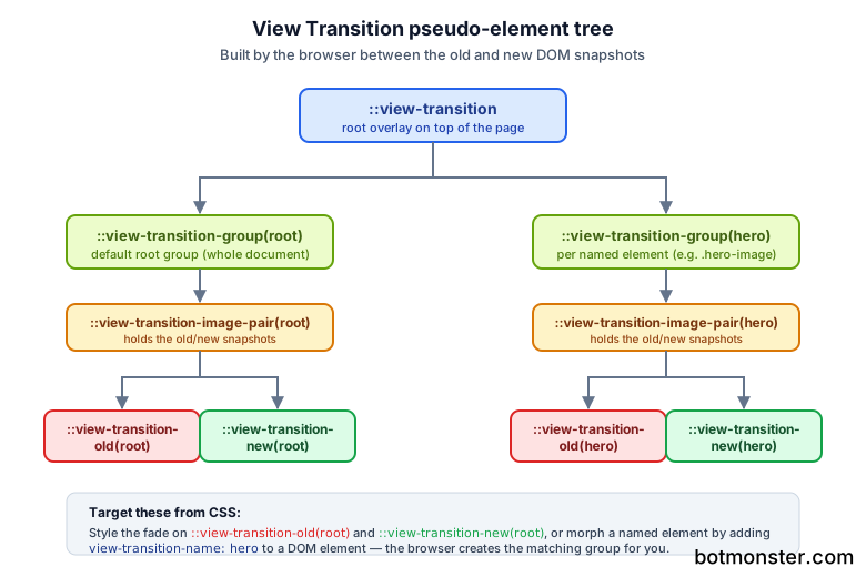
Customising the cross-fade is a CSS job. The browser builds a pseudo-element tree that sits on top of the page during the transition, and you target the parts you care about:
::view-transition-old(root) {
  animation: 300ms ease-out both fade-out;
}
::view-transition-new(root) {
  animation: 300ms ease-out both fade-in;
}

@keyframes fade-out {
  to { opacity: 0; transform: translateX(-30px); }
}
@keyframes fade-in {
  from { opacity: 0; transform: translateX(30px); }
}
That gives you a slide-and-fade on every transition with zero JavaScript animation code. The root identifier refers to the whole document; if you want specific elements to animate independently, you give them a view-transition-name:
.hero-image {
  view-transition-name: hero;
}
Now the hero image becomes its own transition group. If its position, size, or aspect ratio changes between the old and new state, the browser interpolates between the two snapshots. Morphing a thumbnail into a full-size image used to require shared-element libraries; with a view-transition-name it’s one CSS property. Vector assets hold up best here, since the browser scales the snapshot during the morph and an SVG stays sharp at every size; if a logo or diagram only exists as a PNG, trace it into a vector first
before you wire up the transition.
The startViewTransition call returns a ViewTransition object with three promises: updateCallbackDone resolves when your DOM callback finishes, ready resolves when the pseudo-elements are built and the animation is about to start, and finished resolves when the animation fully completes. These hooks let you coordinate other work, for example showing a loading spinner until the new content is ready or running analytics after the animation ends.
A complete tab switcher looks like this:
document.querySelectorAll('.tab').forEach(tab => {
  tab.addEventListener('click', () => {
    if (!document.startViewTransition) {
      switchTab(tab.dataset.target);
      return;
    }
    document.startViewTransition(() => switchTab(tab.dataset.target));
  });
});
The feature detection on the first line is the entire fallback strategy. Old browsers get the instant swap they would have had anyway, new browsers get the animation, and there is no framework in sight.
The same pattern works for swapping paginated content. If you render a list and let people page through it with a jQuery pager such as bootpag
, wrap the handler that replaces the rows in startViewTransition and each page change cross-fades instead of snapping.
Cross-Document Transitions: The MPA Pattern
Cross-document transitions are the reason I started paying attention to this API. They let a classic multi-page site animate between navigations without any JavaScript at all. You add two lines of CSS to both pages and the browser handles the rest.
@view-transition {
  navigation: auto;
}
That’s the opt-in. Put it in the stylesheet of both the source and destination pages (same origin, same scheme) and every navigation between them gets a cross-fade. The browser captures the old document, starts loading the new one, captures it once ready, and animates between them. Hit the back button and the animation runs in reverse automatically.
Shared-element morphs work the same way as in the SPA case, except the names live on elements in two different HTML files. Put view-transition-name: product-image on the thumbnail in the list view and on the large image in the detail view, and the browser morphs one into the other during the navigation. You do not need a routing library, a state store, or any manual position capture - both documents declare the same name and the browser handles the interpolation.
For fine-grained control you can listen for two events. pageswap fires on the outgoing page just before it is captured, and pagereveal fires on the incoming page as it is revealed. Both expose the ViewTransition object, so you can run code at either end, adjust view-transition-name values dynamically based on where the user is coming from, or skip the animation entirely for certain navigation types.
A slide animation on navigation, applied globally:
@view-transition {
  navigation: auto;
}

::view-transition-old(root) {
  animation: 250ms ease-out both slide-to-left;
}
::view-transition-new(root) {
  animation: 250ms ease-out both slide-from-right;
}

@keyframes slide-to-left {
  to { transform: translateX(-20%); opacity: 0; }
}
@keyframes slide-from-right {
  from { transform: translateX(20%); opacity: 0; }
}
Link that stylesheet from every page on a static site and the whole thing starts to feel like a native app, with no build step changes or JavaScript bundle required.
Advanced Techniques
Once the basics are working, a handful of newer features take transitions from “nice” to “native-feeling.” view-transition-class lets you group multiple named transitions under one class and style them together, which is much cleaner than writing a ::view-transition-group selector for each item. A grid of cards becomes:
.card { view-transition-class: card; }

::view-transition-group(.card) {
  animation-duration: 400ms;
  animation-timing-function: cubic-bezier(0.2, 0, 0, 1);
}
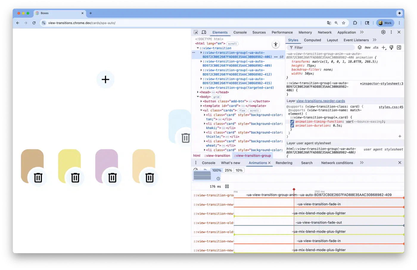
Chrome DevTools understands these pseudo-elements too. From Chrome 139 onwards, the Styles pane resolves ::view-transition-group rules that target a view-transition-class and shows them alongside regular element styles, so you can debug transition CSS the same way you debug any other rule.
The view-transition-name: match-element value, shipping in Chrome 137 and Firefox 144, auto-generates unique transition names based on element identity. Before it landed, animating a list of 50 items meant generating 50 unique names in JavaScript and cleaning them up afterwards. Now a single CSS rule handles the whole list and the browser matches items by identity across the old and new DOM:
.todo-item { view-transition-name: match-element; }Transition types let you run different animations depending on what kind of navigation is happening. You pass a type into startViewTransition (or declare it on @view-transition) and then target it from CSS with :active-view-transition-type(forward). The same page can have a slide-left animation when moving forward in a wizard and a slide-right animation when moving back, all from CSS conditionals.
One thing the API does not handle for you is user motion preferences. Animating content can trigger vestibular symptoms in people with motion sensitivity, and the browser will happily animate regardless unless you tell it not to. Wrap your transition styles in a prefers-reduced-motion
query so the animation collapses to almost nothing when the user has asked for less motion:
@media (prefers-reduced-motion: reduce) {
  ::view-transition-group(*),
  ::view-transition-old(*),
  ::view-transition-new(*) {
    animation-duration: 0.01ms;
  }
}
Screen readers still announce content changes the way they would without transitions, so there is no regression on that front, but do not rely on the animation to convey meaning. If the user cannot see a visual morph, the underlying content change still needs to make sense. The same rule drives form state that screen readers can actually reach : every state change has to surface through markup, not visuals.
Performance and Best Practices
The compositor does most of the heavy lifting, which is why transitions feel smooth even on modest hardware. Snapshots are GPU textures, the animation interpolates opacity and transform, and the main thread is free to run whatever else the page needs. That said, a few habits keep things fast.
Keep durations in the 200-400ms range. Anything shorter feels like a glitch, anything longer feels sluggish and starts to block user input. The default 250ms cross-fade exists for a reason: it’s the sweet spot where the transition is visible but never in the way.
Be frugal with named transitions. Each view-transition-name creates its own capture layer, and capturing 50+ layers on a complex page can introduce a perceptible stutter at the start of the transition. Use named transitions for the handful of elements that actually need to morph, and let everything else cross-fade as part of the root.
Cross-document transitions add 50-100ms to the navigation while the browser captures both documents. On fast connections this is invisible, but on a slow 3G link you may want to scope transitions to instant navigations
only, or skip them entirely when navigator.connection.effectiveType reports 2g or slow-2g.
Test on real mobile devices. Mobile GPUs vary wildly, and a transition that feels buttery on a flagship can stutter on a five-year-old Android phone. The Chrome DevTools Performance panel has a dedicated lane for view transitions since Chrome 139, so you can see exactly how long the capture and animation phases take on your target hardware.
Progressive enhancement comes for free. Feature-detect document.startViewTransition before calling it and the fallback path runs automatically in older browsers. Add the @view-transition at-rule to your CSS and browsers that do not understand it will ignore the rule. There is no failure mode where the page breaks, which is why the API is worth shipping today even though Firefox cross-document support is still pending. Browsers that understand it give users a native-app feel, and everyone else sees the site they would have seen a year ago. The same zero-JavaScript philosophy extends further. The HTML popover attribute
replaces most modal and dropdown JavaScript with a single HTML attribute, and the CSS anchor API pins those popups to their triggers
, applying the same progressive-enhancement pattern to interactive UI elements.