 Botmonster Tech
Drop @view-transition { navigation: auto; } into your stylesheet. Modern browsers will then cross-fade between same-origin page loads on their own. No SPA router, no fetch() interception, no JS framework needed. Add view-transition-name to shared elements like hero images, headings, or nav bars, and the browser morphs them between separate HTML documents. This works today in Chrome 126+, Edge 126+, and Safari 18.2+. Firefox support lands through the Interop 2026
push.
Javascript

Cross-Document View Transitions: Animate Between Full Page Navigations Without JavaScript

HTMX + Alpine.js: 35KB Interactive UIs, Zero Build Step
Combine HTMX
(version 2.0.4, about 14KB gzipped) with Alpine.js
(version 3.15.9, about 17KB gzipped). You get a full interactive web stack for 31KB total. No Webpack. No Vite. No Node.js. No build step. Drop two <script> tags in your HTML, sprinkle a few attributes on your markup, and let any backend serve HTML fragments. That’s the whole setup.
The split is clean. HTMX drives server-side partial updates. Alpine.js covers light client reactivity. The server returns HTML, not JSON. The browser swaps it into the page. Alpine.js attributes in the markup handle toggles, dropdowns, and modals. No compile step sits between you and your running app.

Passkeys and WebAuthn: Ship Passwordless Login With One Evening of Work
Passkeys swap passwords for a public/private keypair kept in the device keychain and unlocked by Face ID, Touch ID, or Windows Hello. The WebAuthn API does the crypto work, while @simplewebauthn/server version 13.3.0 covers Node, Bun, and Deno backends. Sign-up, autofill login, and account recovery all fit in one evening of work.
What Passkeys Actually Are and Why 2026 Is the Year to Ship Them
A passkey is a public/private keypair made on the user’s device. The private key never leaves the secure enclave (Secure Enclave on Apple hardware, StrongBox on Android, TPM on Windows). Only a signed challenge travels over the wire. Your server stores no shared secret to steal and no hash to crack offline. The signature is bound to your domain, so it can’t be phished. If a user visits examp1e.com instead of example.com, the browser refuses to sign. Credential phishing ends at the protocol layer.

Custom Linter Rules: JavaScript, Python, Go ASTs
You can catch domain-specific anti-patterns that ESLint
, Ruff
, or golangci-lint
miss by writing custom linter rules that parse your code into an Abstract Syntax Tree (AST), walk the tree to match specific node patterns, and report violations with auto-fix suggestions. The process is the same regardless of language: parse source into a tree, define the pattern you want to catch, walk the tree to find matches, and emit diagnostics. In JavaScript/TypeScript, this means writing an ESLint plugin with a visitor-pattern rule. In Python, you write a flake8 plugin using the ast module or a Ruff plugin in Rust. In Go, you use the go/ast and go/analysis packages.

WCAG 2.2 Web Forms: Error Handling, Validation, ARIA
Accessible web forms start with semantic HTML and use ARIA only to fill gaps native elements can’t reach. Use aria-live for error announcements and aria-describedby to link messages to fields. Following WCAG
2.2 AA ensures every user can perceive, navigate, and complete your forms using only a keyboard.
Most form accessibility failures are not caused by missing ARIA. They come from developers skipping basic HTML semantics like labels and fieldsets. Patching this damage with ARIA often makes things worse. The W3C’s first rule is simple: no ARIA is better than bad ARIA. Misapplied roles or redundant labels create noise instead of clarity.
Monorepo Management with Turborepo: A Practical Guide
Turborepo
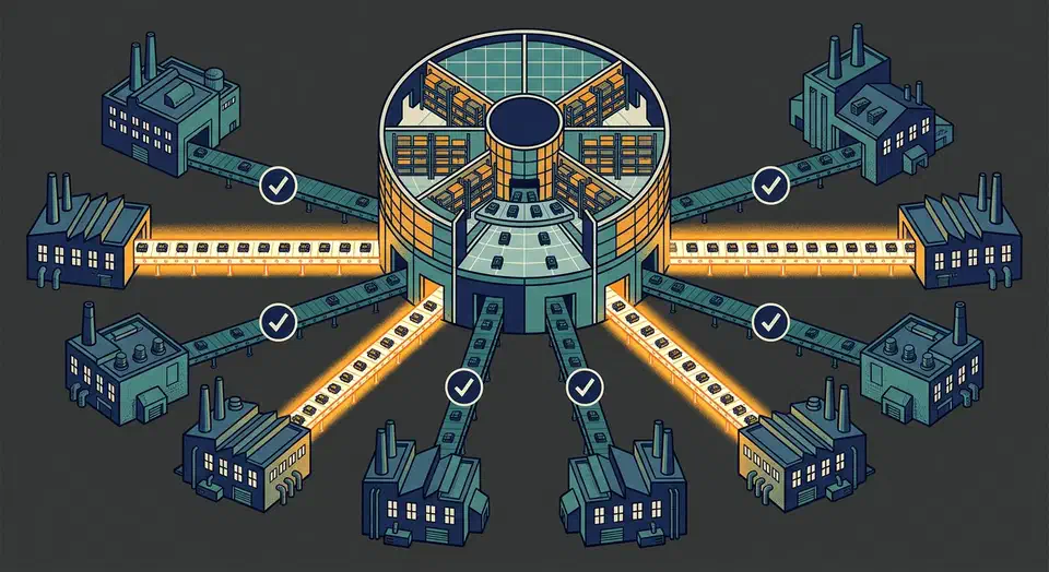
is a fast build system for JavaScript and TypeScript monorepos. It uses content-aware caching, parallel tasks, and smart dependency ordering. The result: multi-package repos that stay fast to work with. You define workspace packages in a pnpm-workspace.yaml file, then add a turbo.json that declares task dependencies and caching rules. Turborepo handles the rest. Running turbo run build only rebuilds packages whose source files changed. Cache hits restore build outputs in milliseconds instead of minutes.